Last Updated on: September 1, 2025Struggling to make colors look right under your new floodlights? Poor color rendering can ruin a project’s aesthetics and perceived quality. I’ll show you how to choose the right CRI every time.
The Color Rendering Index (CRI) measures how accurately a light source reveals the true colors of objects compared to natural sunlight. For LED floodlights, a higher CRI means colors appear more vibrant and natural. This is crucial for aesthetics, safety, and the overall quality of any lighting project.
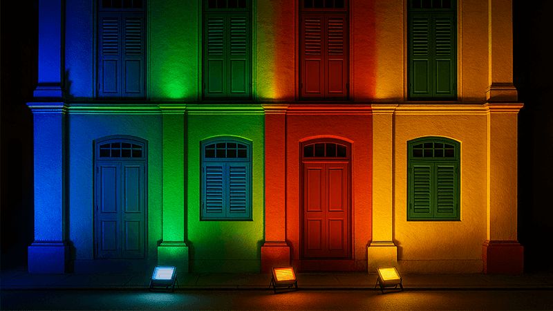
Now that you understand the basic idea of CRI, you might be wondering about the specific numbers. I’ve seen many purchasing managers, like my client Shaz from the UAE, get stuck on whether to choose 80, 90, or even higher CRI. It’s not just about picking the biggest number. Let’s break down what these values actually mean for your projects and how to make the right choice without wasting your budget. Understanding this will give you a big advantage.
What is a good CRI for LED lights?
Do you feel overwhelmed by CRI ratings like 70, 80, or 90+? Choosing the wrong one can make a beautifully designed space look dull and lifeless. Here’s a simple guide to get it right.
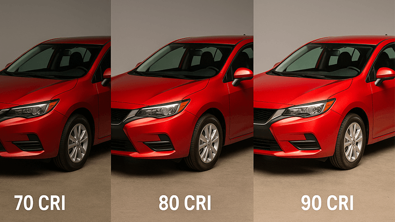
A CRI of 80 is generally considered the industry standard for most outdoor and commercial applications. It provides a great balance of color quality and cost. For applications where color accuracy is critical, like retail displays or architectural facades, a CRI of 90 or higher is the better choice.
Dive Deeper: Beyond the Average Score
When we talk about CRI, we’re usually talking about the Ra value. Think of Ra as an "average score." It’s calculated by averaging the light source’s ability to render a set of eight standard, pastel-like colors (R1-R8). A CRI of 80 means the light scored an average of 80 out of 100 on these eight colors. This is fine for general purposes, but it has a major weakness. The Ra value does not include saturated colors.
That’s where the R9 value comes in. R9 is a separate score that measures how well a light source renders a saturated red color. This single value is incredibly important because so many things in our world contain red. Think about skin tones, wood finishes, red-colored bricks, or fresh produce. A light can have a respectable CRI of 80 but a very low or even negative R9 score. The result? People look pale and unhealthy, and red objects appear brownish and dull. In my experience, a low R9 value is often the reason a client is unhappy with their new lighting, even if the "CRI" on the spec sheet looked good.
When selecting lights, especially for projects where appearance matters, don’t just ask for the CRI. Ask for the R9 value, too.
| CRI Level |
R9 Value |
Common Applications |
My Recommendation |
| 70-79 |
Often low |
Street lighting, basic warehouses, areas where color isn’t key. |
Acceptable only when budget is the absolute top priority. |
| 80-89 |
Varies |
Offices, schools, parking lots, general facade lighting. |
The best all-around choice for quality and value. Always ask for the R9 value. |
| 90+ |
Usually >50 |
High-end retail, museums, healthcare, luxury residential. |
Essential when color appearance directly impacts sales, safety, or experience. |
Remember, CRI also works hand-in-hand with Correlated Color Temperature (CCT). A high-CRI light at a warm 3000K CCT will make a space feel cozy and rich. The same high CRI at a cool 5000K will make it feel crisp and clean. You can’t consider one without the other.
Is there a noticeable difference between 80 and 90 CRI?
Is paying more for 90 CRI really worth it? You might be spending extra budget for a difference that your client won’t even notice. Let me explain when it matters and when it’s just a number.
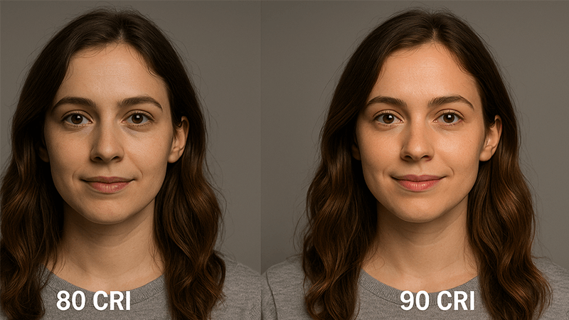
Yes, for most people, there is a very noticeable difference between 80 and 90 CRI, especially with warm colors. Reds, oranges, and skin tones appear much more vibrant and true-to-life under 90 CRI light. In a side-by-side comparison, an 80 CRI light can make these colors look flat.
Dive Deeper: When the Difference is a Deal-Breaker
I remember a project for a high-end hotel in Dubai. The architect had specified a beautiful terracotta finish for the exterior walls. My client, the project contractor, initially installed 80 CRI floodlights to save on costs. The result was disappointing. Under the lights, the rich, red-orange terracotta looked like a dull, flat brown. The architect was not happy. We ran a test on a small section of the wall, replacing one of the 80 CRI fixtures with a 90+ CRI floodlight that had a high R9 value.
The difference was immediate and dramatic. The wall came to life. The colors were deep and rich, exactly as the architect had envisioned. The client immediately approved the change for the entire project. That experience taught me a valuable lesson: the "small" jump from 80 to 90 CRI can be the difference between a satisfied client and a failed project.
The reason for this dramatic change goes back to the R9 value (saturated red). While an 80 CRI light might render blues and greens reasonably well, it often struggles with red. A 90+ CRI light, by nature of its higher-quality spectral output, almost always has a strong R9 value. This means it delivers a much more complete and balanced spectrum of light, closer to that of the sun.
| Feature |
80 CRI Light |
90+ CRI Light |
Is the difference noticeable? |
| Warm Colors |
Reds, oranges, and yellows can appear muted. |
Colors are vibrant, deep, and saturated. |
Yes, very. This is the most significant difference. |
| Skin Tones |
People can look pale or slightly washed out. |
Skin tones look healthy, natural, and lively. |
Yes. Crucial for hospitality and retail environments. |
| Overall Vibe |
Can feel slightly artificial or "flat." |
The environment feels more natural and engaging. |
Yes. It contributes to the perceived quality. |
| Cost |
More budget-friendly. |
Higher initial cost. |
For many projects, the visual impact justifies the cost. |
So, is the difference noticeable? Absolutely. While you might get away with 80 CRI for a large, open parking lot where the main goal is just visibility, you should seriously consider 90+ CRI for any application where aesthetics, mood, and the accurate representation of color are important.
Are high CRI bulbs worth it?
Everyone in the industry says "high CRI is better," but does that automatically make it the right choice for every project? Over-specifying can waste money and energy without adding any real value. Let’s break down the cost-benefit realistically.
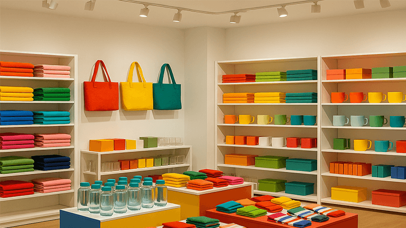
High CRI bulbs are absolutely worth it when color accuracy directly impacts the goal of the space. This includes selling products, creating a welcoming ambiance, or ensuring safety. For purely functional tasks where color isn’t critical, standard 80 CRI offers a more cost-effective and energy-efficient solution.
Dive Deeper: Matching CRI to Your Project’s Goal
The most common mistake I see is thinking that high CRI is a universal sign of quality. It’s not. The "best" light is the one that’s right for the job. A high CRI of 95 doesn’t automatically mean the light is "comfortable" or "good-looking." For example, a 95 CRI light with a very cool, almost blue, 6500K CCT might render colors perfectly accurately, but it would feel sterile and harsh in a fine-dining restaurant. The client would hate it. Comfort and aesthetics come from the right combination of high CRI and the appropriate CCT.
Furthermore, there is often a trade-off between CRI and luminous efficacy (lumens per watt). The phosphors and LED chips required to produce a high-CRI light are generally less efficient than those used for lower-CRI lights. This means a 90 CRI floodlight might produce fewer lumens per watt than an 80 CRI floodlight. To achieve the same level of brightness, you might need a higher wattage fixture, which increases both the initial cost and long-term energy consumption.
Let’s look at two common scenarios for a purchasing manager like Shaz:
Scenario A: Industrial Warehouse & Logistics Park
- Primary Goal: Safety and visibility for workers and vehicles.
- Color Importance: Low. Workers need to see obstacles, but the exact shade of a shipping container is irrelevant.
- Best Choice: 70 or 80 CRI.
- Justification: Here, luminous efficacy is king. You want the most light for the least amount of energy. Spending extra on 90 CRI would be a complete waste of money that could be better spent on more fixtures or higher-wattage ones to improve overall brightness and safety.
Scenario B: A New Car Dealership Showroom & Lot
- Primary Goal: Make the cars look amazing and attract customers.
- Color Importance: Critical. The deep metallic red of a sports car must look rich and vibrant, not dull brown.
- Best Choice: 90+ CRI with a high R9 value.
- Justification: The slightly higher cost and lower efficacy of the 90+ CRI lights are easily justified. The superior color rendering is a sales tool. It makes the product more appealing, which directly contributes to the client’s bottom line. Using 80 CRI here would be a costly mistake in lost sales opportunities.
So, are high CRI bulbs worth it? Yes, but only when you’ve clearly defined the project’s goal. Don’t pay for performance you don’t need.
Why is CRI important in lighting?
Do you sometimes think lighting is just about making a space bright enough to see? If you ignore color quality, you risk creating environments that look cheap, feel wrong, or are even unsafe. Let me explain why CRI is a fundamental pillar of good lighting design.
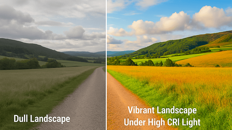
CRI is important because it directly affects how we perceive the world. Good color rendering enhances the beauty of a space, improves safety by making signs and hazards easier to distinguish, and can even influence our mood and behavior. It defines the quality of light far beyond simple brightness.
Dive Deeper: The Core Functions of Color Quality
From my years of manufacturing and working on global projects, I’ve seen firsthand that the importance of CRI boils down to three key areas: aesthetics, safety, and functionality. It’s not an abstract number; it has real-world consequences.
1. Aesthetics & Commercial Impact
This is the most obvious one. For architectural facades, landscapes, retail stores, museums, and restaurants, color is everything. A high CRI brings out the rich textures of stone and brick, makes a landscape look lush and alive, and ensures products on a shelf look appealing. In retail, better color rendering can directly lead to increased sales. No one wants to buy a red dress that looks brown under the store’s lights.
2. Safety & Clarity
This is an often-overlooked but critical aspect. In an industrial or commercial setting, many safety warnings rely on color. Think of the red on a fire extinguisher, the yellow on a caution sign, or the different colors of electrical wiring. Under a low CRI light source, these colors can be difficult to distinguish, especially for someone with a mild color vision deficiency. This can lead to dangerous mistakes. In a parking garage, high CRI light makes it easier to find your car because you can actually recognize its true color, and it enhances the sense of security.
3. Functionality & Performance
In certain environments, CRI is essential for the task at hand. In a medical setting, doctors and nurses need to accurately assess skin tones and tissue colors for diagnosis. In a TV studio or sports stadium, high CRI lighting is non-negotiable for broadcast quality, ensuring viewers at home see accurate team colors and sharp images.
It’s also important for an expert like you to know that CRI (Ra) is not a perfect system. It has known flaws, particularly in how it evaluates saturated blue and green colors. This is why the industry is slowly looking at more advanced metrics like IES TM-30, which provides a much more detailed and accurate picture of color rendition. While CRI is still the standard, being aware of its limitations shows a deeper level of expertise.
Ultimately, CRI cannot be considered in isolation. It is always linked to CCT. You must first choose the desired mood with CCT (warm, neutral, or cool), and then choose the level of CRI to ensure the colors within that mood are rendered accurately.
Conclusion
Choosing the right CRI isn’t about always picking the highest number. It’s about a smart analysis of your project’s goals to match color quality with specific needs for the best performance and value.