Your lighting projects produce muddy colors, making designs look unprofessional. Understanding the secrets of RGB vs. RGBW mixing will give you clean, vibrant colors every time.
RGB lights often create a "dirty white" because of LED inconsistencies and spectrum impurities. The solution is to use RGBW fixtures, which include a dedicated white LED. This provides much cleaner colors, purer whites, and greater flexibility for creating professional lighting designs.

Now you know the basic difference, but the real magic is in the details of how you control them. After years of manufacturing and installing these lights, I’ve learned a few secrets that separate an average lighting job from a spectacular one. It’s not just about the hardware, but how you use it. Let’s dive deeper into how you can master color mixing for both types of lights to make your projects stand out.
How do you mix colors on LED lights?
Mixing colors on LED lights often feels like frustrating guesswork. You aim for a specific shade, but you end up with unpredictable results that don’t match your vision.
You mix colors by adjusting the brightness levels of the individual red, green, and blue LEDs. In RGBW fixtures, you also control a separate white channel. This gives you a powerful tool for creating pure whites and delicate pastel colors that RGB alone cannot achieve.

The Secret of RGB Color Mixing
When I first started in this industry, I thought mixing colors with RGB LEDs would be simple. In theory, red, green, and blue at full power should make a perfect white. But in practice, it almost never does. The white light often has a pink or greenish tint. We call this "dirty white" or "synthetic white." This happens for a few reasons. First, there are tiny differences between individual LED chips, even from the same batch. Second, as LEDs age, their color can shift. Finally, the light spectrum from each color LED isn’t perfectly pure.
This also affects brightness. If you want to create yellow, you mix red and green (R+G). This means the blue LED is off, so you are only using two-thirds of the fixture’s potential power. Your light output drops. While RGB is great for creating strong, saturated colors like a pure red or a deep blue, it really struggles with pastel shades. If you want a light pink, you need to add "white" to your red. With RGB, your only option is to mix in that "dirty" synthetic white (R+G+B), which makes the final color look gray and muddy, not clean and bright.
The Secret of RGBW Color Mixing
This is where RGBW fixtures changed the game for me. Adding that fourth, dedicated white chip (the "W") solves so many of the problems we see with RGB. When you need white light, you just turn on the white channel. Instantly, you get a clean, pure, bright white light with a much better Color Rendering Index (CRI).
This makes mixing pastel colors simple and beautiful. To get that light pink color, you just add a little bit of red light to the pure white light. The result is a clean, bright pink that looks vibrant and intentional. It’s not washed out or dirty. RGBW is also more energy-efficient. If a design requires a lot of white or light-colored light, using the high-power white LED is much more efficient than running all three R, G, and B channels at once. The only tradeoff is complexity. You now have four channels to control. A single color can be mixed in different ways. This requires more skill from the lighting programmer to find the best mixing strategy.
What is it called when you mix RGB colors by adding one colored light beam on top of another?
You know how it works, but you don’t know the proper term. This can make you sound less experienced when discussing project details with engineers or other suppliers.
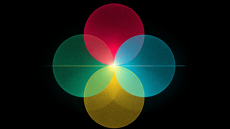
This process is called Additive Color Mixing. You start with darkness (black) and add different amounts of red, green, and blue light together. When combined, they create a wider spectrum of colors, including white.

Understanding Additive vs. Subtractive Color
In the lighting world, everything we do with color is based on the additive model. It’s the principle behind every screen you look at and every DMX fixture you program. But it’s important to understand how it differs from the color model used in the physical world of print.
Additive Color (RGB)
This model is for sources that emit light.
- Starting Point: Black (the absence of light).
- Primary Colors: Red, Green, Blue.
- Process: You add light together.
- Result: The more light you add, the closer you get to white.
| Combination |
Resulting Color |
| Red + Green |
Yellow |
| Green + Blue |
Cyan |
| Blue + Red |
Magenta |
| Red + Green + Blue |
White |
As a lighting professional, like my friend Shaz, a purchasing manager in the UAE, you are always working in the additive color space. This is critical. A client might give you a brand guide with colors specified for print, using CMYK values. You cannot simply use those numbers for lighting. The colors have to be "translated" from the subtractive print model to the additive light model. Digital tools can help get you close, but they don’t account for the specific fixture or the surface it’s lighting. This is why on-site testing and calibration are so important. You must see how the light renders in the real world.
Subtractive Color (CMYK)
This model is for surfaces that absorb or reflect light, like ink on paper.
- Starting Point: White (paper reflecting all light).
- Primary Colors: Cyan, Magenta, Yellow, plus Black (Key).
- Process: You add pigments that subtract (absorb) wavelengths of light.
- Result: The more pigment you add, the closer you get to black.
Understanding this difference makes you a better buyer and manager. You can have more intelligent conversations with both clients about their brand colors and with technicians about programming them correctly.
What is the RGB color mixing ratio?
You try to create a clean white light with an RGB fixture, but the result is always slightly pink or green. No matter what, your "white" light looks off, ruining the atmosphere you’re trying to create.
There is no universal RGB ratio for perfect white. It changes based on the specific LEDs, their manufacturing bin, their age, and the driver. A common starting point is to slightly reduce the red channel, but you must always adjust by eye to find the perfect balance.

Practical On-Site Tips for RGB Fixtures
Over the years, I’ve spent countless hours on-site getting colors just right. The biggest lesson I’ve learned is this: trust your eyes, not just the DMX values on the controller. When you set Red, Green, and Blue all to their maximum value (255), you will almost never get a pure white.
Here is my process. First, I tell the programmer to bring R, G, and B to full. Then, we look at the white light it creates on the target surface. Usually, it’s a bit pinkish or magenta. This tells me the red LEDs are slightly overpowering the others. I then have them slowly dial down the red channel, maybe to 240, then 230. We keep going until that pink tint disappears and the white looks clean and neutral. It is a process of small adjustments. Once we find that perfect balance, we save it as a "White" preset in the DMX controller. Now, whenever we need white, we can call up that preset instead of just setting RGB to 255. I also recommend favoring colors made from two-channel mixes, like yellow (R+G) or cyan (G+B). They are often much brighter and purer than colors that require all three channels to be mixed.
Advanced Mixing Strategies for RGBW Fixtures
With RGBW, you have incredible power, but you need a strategy. You can’t just mix all four channels randomly. The biggest secret I can share is to decide on your mixing strategy before you start programming.
Strategy A: RGB Primary, W for Tinting (Most Flexible)
This is my recommended method for most applications. You treat the fixture as an RGB device first and use the white channel as a special tool to adjust brightness and saturation.
- For High-Saturation Colors: Keep the white channel at 0. Use only the R, G, and B channels to mix your deep blues, rich reds, or vibrant greens.
- For Pastel Colors: First, create your base color with RGB. For example, mix a purple using red and blue. Then, slowly fade in the white channel. The purple will instantly become a clean, bright lavender. The white light "washes out" the color without making it look gray.
- For Pure White: Turn the R, G, and B channels to 0 and use only the white channel. This gives you the best quality and most efficient white light.
Strategy B: W Primary, RGB for Coloring
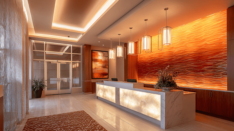
This is a more artistic approach. I remember a project for a hotel lobby in Dubai where we used this method. We set the white LEDs to a comfortable brightness first. Then, we added just a tiny amount of red and green to "stain" the white light, giving it a unique, warm amber glow. It created a very sophisticated atmosphere that you couldn’t get from a standard warm white fixture. This method is perfect for creating subtle architectural looks.
How does the color of light affect the design of a lighting scheme?
You’ve mastered the technical side of color mixing. But your lighting designs still feel like they’re missing something; they don’t have a real impact on the space.
Poor color choices can make a beautiful space feel cold, jarring, or cheap. The color of light is a powerful tool that directly affects the mood and guides how people perceive and interact with an environment.

Color Psychology in Lighting Design
Color isn’t just decoration; it’s communication. The choices you make can completely change the feeling of a room or a building facade. As manufacturers, we provide the tools, but it’s the designers who use this psychology to create experiences.
| Color Type |
Colors |
Psychological Effect |
Common Applications |
| Warm Colors |
Red, Amber, Orange, Warm White |
Inviting, Cozy, Intimate, Energizing |
Restaurants, Lounges, Hotel Lobbies, Homes |
| Cool Colors |
Blue, Green, Cool White |
Calming, Focused, Spacious, Modern |
Offices, Hospitals, Spas, Task Lighting |
| White Light |
2700K – 5000K+ CCT |
Varies by color temperature |
Retail (4000K), Industrial (5000K+) |
Even the "color" of your white light is crucial. A warm white light around 2700K feels like home, like an old incandescent bulb. A neutral white at 4000K is great for offices and retail because it feels alert and colors look true. A cool white above 5000K is very crisp and is often used for industrial areas or security lighting. With DMX-controlled RGBW lights, you have the power to create any of these feelings on command.
Using Color to Shape Perception
Good lighting design uses color to do more than just make things visible. It adds a new dimension to architecture and space. You can use a narrow beam of light to graze a stone wall, and the shadows will make the texture pop. You can use color to draw the eye to a building’s most important feature. In a large, open-plan office, you can use color to create zones. For instance, a focused, neutral white light can illuminate workstations, while a softer, warmer, slightly blue-tinted light can define a collaborative lounge area.
The most exciting part is dynamic lighting. A building facade can be lit in a sophisticated, pure white for most of the year. But for a national holiday or a special event, a DMX program can instantly transform it into a vibrant, colorful display. This is where RGBW fixtures are invaluable. They provide that high-quality architectural white and the full-saturation color in a single, powerful package.
Conclusion
Mastering RGB and RGBW color is about more than technology. It’s about using the right fixture and strategy to create clean, intentional colors that bring your design vision to life.