Picking the wrong LED floodlight color can ruin a project’s feel and function. A costly mistake can affect safety and comfort. Let’s make sure you get it right every time.
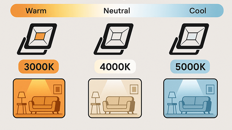
To choose the right LED floodlight color temperature, match the Kelvin (K) rating to the space’s main function. Use warm whites (2700K-3000K) for comfort and cool whites (4000K-5000K) for visibility and security. This is the key to maximizing the floodlight’s effectiveness.
That simple answer is just the start. I’ve spent years in the LED lighting industry, from the factory floor to founding Upward Lighting. I’ve seen how getting the color temperature right can make or break a project. Let’s dive deeper into what these numbers really mean, so you can make informed decisions for your clients, just like I’ve helped my partners do.
What Does Color Temperature Mean in LED Lights?
"Color temperature" can sound confusing with all its numbers. This confusion often leads to picking the wrong light. It’s just a simple scale from warm yellow to cool blue.
Color temperature, measured in Kelvin (K), describes the color appearance of a light source. Lower Kelvin values (e.g., 2700K) produce a warm, yellowish light, like a traditional bulb. Higher Kelvin values (e.g., 5000K) produce a cool, bluish-white light, similar to daylight.
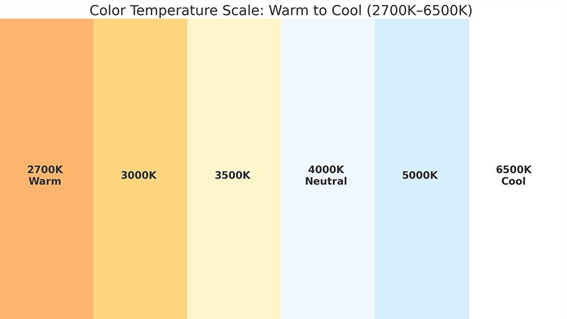
When I first started working in an LED lighting factory, the concept of color temperature seemed complex. But my mentor explained it with a simple analogy that has stuck with me. Imagine heating a piece of metal. First, it glows red, then orange, then yellow, and eventually a bright, bluish-white. The Kelvin scale works the same way. It measures the color appearance of light, not the actual heat it produces. Lower Kelvin numbers mean a warmer, more yellow light, while higher numbers mean a cooler, bluer light. Mastering this concept was one of the first things I did, and it’s been essential ever since in helping my partners get exactly what they need.
To make this clearer, let’s break it down.
| Kelvin (K) Range |
Appearance |
Feeling / Vibe |
Common Use Case |
| 2000K – 2700K |
Very Warm White |
Intimate, cozy, candle-like |
Restaurants, living rooms |
| 3000K |
Warm White |
Inviting, relaxing |
Homes, hotel lobbies |
| 4000K |
Neutral / Cool White |
Clean, focused, alert |
Offices, garages, kitchens |
| 5000K – 6500K |
Daylight / Cool Blue |
Crisp, bright, energizing |
Warehouses, hospitals, security |
Understanding this spectrum is the foundation for any lighting project. For a purchasing manager like Shaz, knowing these ranges helps you communicate exact specifications to suppliers like me. It ensures the final product we manufacture matches the client’s vision perfectly. It’s about translating a desired feeling into a technical number that we can build into a reliable product.
Is 3000K or 4000K Better for Outdoor Lighting?
Choosing between 3000K and 4000K for outdoor lighting is a common problem. The wrong choice can ruin the atmosphere, making a space feel unwelcoming. The best choice depends on your goal.
Neither is universally "better." Choose 3000K for a warm, inviting atmosphere, perfect for residential areas, patios, and landscape lighting. Opt for 4000K for a clearer, neutral white light that enhances security and visibility in commercial spaces, parking lots, and building perimeters.
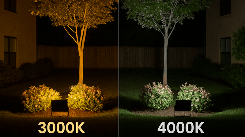
This is a question I get all the time from partners, and the answer always comes back to the project’s purpose. There is no single "best" option. It is about matching the light to the desired outcome. I recall working with a client on a luxury hotel project in the UAE. They wanted the entrance and garden areas to feel exclusive and relaxing for guests. We chose 3000K floodlights to create that warm, welcoming glow. For the staff parking area and loading docks, we used 4000K to ensure safety and clear visibility. The same project required two different solutions, both equally "correct" for their specific location.
For you, as a purchasing manager, the key is to ask your client, "What do you want people to feel in this space?" Here’s a simple comparison to guide that conversation.
3000K vs. 4000K for Outdoor Applications
| Feature |
3000K (Warm White) |
4000K (Neutral White) |
| Primary Goal |
Ambiance, comfort, relaxation |
Security, visibility, task performance |
| Best For |
Building facades, residential landscapes, patios, walkways |
Parking lots, building perimeters, work areas, sports courts |
| Psychological Effect |
Creates a cozy, inviting, and high-end feel |
Promotes alertness, clarity, and a sense of safety |
| Color Rendition |
Makes warm colors (reds, yellows) pop; can dull blues |
Provides more accurate, balanced color rendition |
By understanding these differences, you can guide clients to the perfect choice. This ensures the lighting not only illuminates but also enhances the function and feel of the space, making you a more valuable partner in their project.
How Do You Choose the Right LED Lighting Product Color Temperature?
Knowing the theory is great, but choosing a real product is hard. Overwhelmed with options, you might pick one that doesn’t fit the project’s needs. Use a simple, function-first process.
First, define the primary function of the space: is it for work, relaxation, or security? Then, match that function to the appropriate Kelvin range. Finally, consider the surrounding environment and the materials being illuminated to fine-tune your selection for the best aesthetic result.
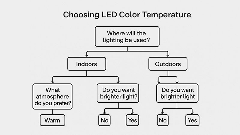
My entire business philosophy at Upward Lighting is built on one simple question I ask every partner: “What is the main function of this space?” Answering this is the critical first step in choosing the right color temperature. Everything else follows from there. This is the core of "My insights" in our work together. Let’s walk through the exact process I use with my own team to develop and recommend lighting solutions.
Step 1: Define the Primary Function
Ask the simple question first. Is the lighting for safety in a dark alley? Is it to highlight the architectural features of a building? Or is it to create a relaxing atmosphere on a restaurant patio? You have to be very specific about the primary goal before looking at any product specifications.
Step 2: Match Function to a CCT Range
Once you know the function, selecting the Kelvin range becomes easy. Use this as a general guide:
- Security & Safety: 4000K – 5000K for maximum visibility and clarity.
- Task & Work Areas: 4000K for focused, clear light that reduces eye strain.
- General Ambiance & Welcome: 3000K for a comfortable, inviting feel.
- Accent & Architectural: 2700K – 3000K to highlight textures and create drama.
Step 3: Consider the Materials and Colors
Finally, think about what the light will be hitting. A 3000K light will make a brick facade or wooden deck look rich and warm. A 4000K light will make modern materials like steel and concrete look clean and crisp. This final check ensures the light complements the environment, not clashes with it.
What’s the Difference Between 2700K and 3000K Color Temperature?
The difference between 2700K and 3000K seems small. But the wrong choice can make a space feel dated or not cozy enough. Understanding this small gap is key to mastering atmosphere.
The main difference is the amount of yellow light. 2700K is a very warm, yellowish light, similar to an old incandescent bulb, creating a vintage or intimate feel. 3000K is also warm but has less yellow, appearing cleaner and more modern while still feeling inviting.
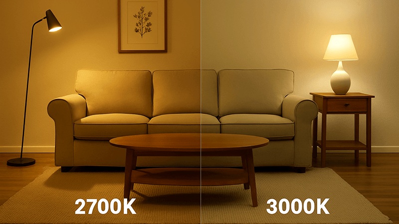
In my years of manufacturing and supplying lights, I’ve learned that the details matter most. The 300-Kelvin difference between 2700K and 3000K might seem small on paper, but it has a noticeable impact on the atmosphere of a space. Think of it as the difference between the deep, orange glow of candlelight and the soft, white-gold of an early morning sun. Both are warm, but they create different feelings.
Here’s how to think about them for your projects:
2700K vs. 3000K: A Subtle but Important Choice
| Feature |
2700K (Very Warm White) |
3000K (Warm White) |
| Analogy |
Traditional Incandescent Bulb / Sunset Glow |
Halogen Bulb / Early Morning Sun |
| Feeling |
Cozy, intimate, traditional, vintage |
Welcoming, relaxing, clean, modern |
| Best For |
Residential living rooms, fine dining, historic buildings |
Hospitality spaces, modern homes, hotel lobbies, retail |
| Key Takeaway |
Strong yellow/orange hue for maximum coziness. |
A cleaner warm white that still feels comfortable. |
As a purchasing manager, recommending the right one can show a deep level of expertise. 2700K is perfect when a client wants to replicate that classic, incandescent feel, maybe for a historic renovation. However, for most modern hospitality and commercial projects requiring a warm feel, 3000K is the industry standard. It provides warmth without appearing dated. When my partners are unsure, I often suggest 3000K as the more versatile and widely accepted choice for "warm white."
Conclusion
Choosing the right LED floodlight color temperature is simple. Always start by asking "What is the space for?" to match the light’s feel with its function perfectly.