Choosing the right floodlights feels like it’s just about brightness. But inferior lights can make everything look washed out. The secret is focusing on Color Rendering Index (CRI) for true quality.
The Color Rendering Index (CRI) is the key metric for lighting quality. It measures how accurately a light source reveals the true colors of objects. A high CRI ensures that building facades, landscapes, and products look vibrant and natural, not dull and distorted under your LED floodlights.
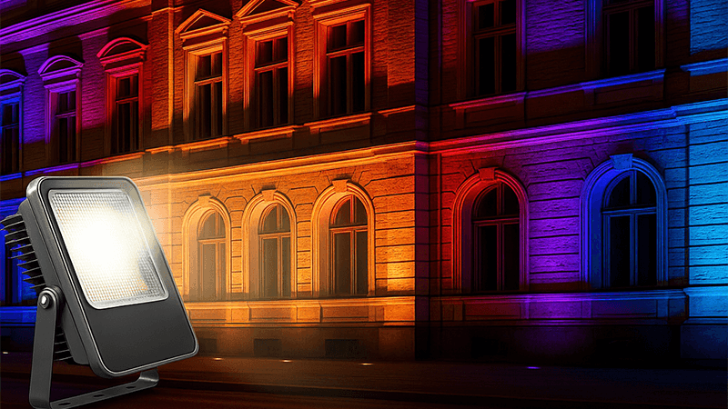
For years, I’ve seen purchasing managers focus almost exclusively on lumens and watts. I get it. Lumens tell you how bright a light is, and wattage tells you how much power it uses. These are simple, hard numbers that are easy to compare on a spec sheet. But they don’t tell the whole story. They don’t tell you about the quality of the light.
As someone who built a business on lighting quality, I’ve learned that the real "wow" factor, the thing that makes a project truly shine, is how the light renders color. This is where CRI comes in. It’s the difference between a flat, lifeless scene and one that is rich, vibrant, and true to life. Let’s break down what this really means for you when you’re sourcing your next batch of LED floodlights.
You see "CRI" on every spec sheet, but what does it really mean for your project? Ignoring it can lead you to choose lights that make beautiful architecture or landscapes look cheap.
CRI’s purpose is to measure a light’s ability to show object colors realistically when compared to a natural light source like the sun. It works on a scale from 0 to 100. A high CRI makes colors pop, while a low CRI can make them look muted or off.
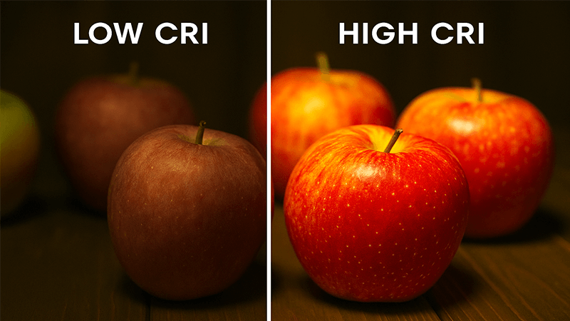
Let’s dive deeper into this. Think of natural sunlight as the perfect standard for color, so it gets a CRI score of 100. An old-style incandescent bulb is also very close to 100. The CRI value of an LED light tells you how close it comes to this perfect standard. The index is calculated by comparing the appearance of eight standard pastel colors (known as R1-R8) under the test light versus a reference light source. The average score becomes the general CRI, often written as "Ra".
But here’s a pro tip for you: always ask about the R9 value. R9 measures a light’s ability to render a deep, saturated red color. This specific value is crucial for accurately showing skin tones, red-brick buildings, rich wood finishes, and even fresh produce. Unfortunately, R9 is not included in the general CRI (Ra) calculation. I’ve seen many lights with a decent CRI of 80 that have a very low or even negative R9 score, making reds look brownish and dull. For any project where color vibrancy is important, a high R9 value is non-negotiable.
| CRI Value (Ra) |
Light Quality |
Typical Application |
| 90+ |
Excellent / Museum Quality |
Art galleries, high-end retail, medical exams |
| 80-90 |
Good / High Quality |
Commercial projects, quality residential, offices |
| 70-80 |
Fair / Basic Quality |
Street lighting, parking lots, industrial warehouses |
| <70 |
Poor |
Not recommended for most modern applications |
What CRI Should You Expect from Modern LED Lights?
LED technology has improved dramatically. Relying on old standards means you are probably buying outdated, low-quality products. It’s time to update your expectations and know what good LEDs can deliver.
For basic outdoor floodlighting like parking lots, a CRI over 70 is acceptable. For any project where appearance matters, like architectural lighting or retail spaces, you should demand a CRI of 80 or higher. Top-tier LEDs can easily achieve CRI 90+, so don’t settle for less.
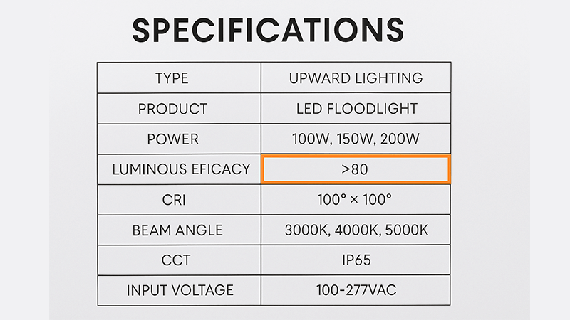
When I first started in this industry, getting a good CRI from an LED was a huge challenge. Early LEDs were known for their poor color rendering, often making spaces feel cold and clinical with a blueish tint. The CRI was often down in the 60s. Manufacturers had to make a choice between efficiency (lumens per watt) and light quality. Thankfully, those days are long gone.
The big change came from advancements in phosphor technology. LEDs create white light when a blue LED chip activates a layer of phosphors. By developing sophisticated new phosphor blends, manufacturers like us can now produce LEDs that deliver both high efficiency and excellent color rendering. This means you no longer have to sacrifice one for the other.
I remember a client in the UAE, a project contractor for a new luxury resort. He was about to sign off on a large order of CRI 70 floodlights because the price was low and the lumens were high. I convinced him to wait and sent a few of our CRI 90 samples. We set up a demo, lighting up a section of the resort’s sandstone facade and its lush gardens. The difference was night and day. Under the CRI 90 lights, the golden tones of the stone were rich and warm, and the greens of the palm trees were deep and vibrant. The cheaper lights just made everything look flat and yellowish. He immediately understood the value and changed his order. That is the power of quality light.
| Application |
Minimum Recommended CRI |
Why it Matters |
| Parking Lot |
70+ |
Primarily for visibility and safety; color is secondary. |
| Building Facade |
80+ |
To accurately render building materials and architectural details. |
| Landscape Lighting |
80+ |
To make plants, flowers, and trees look natural and vibrant. |
| Sports Field |
80+ (90+ for broadcast) |
For player visibility and to make team uniforms clear for fans/TV. |
| Retail Storefront |
90+ |
To make products look appealing and true to their real color. |
Is a Higher CRI Always Better?
You might assume that you should always choose the highest CRI possible, like 95+. But this can inflate your project costs and even reduce efficiency without any real benefit. You need to pick wisely.
No, a higher CRI isn’t always better. While superior for color, very high CRI (95+) lights can be less energy-efficient and more expensive. The smart choice is to match the CRI level to the specific needs of the application. For many floodlight projects, CRI 80 is the perfect balance.
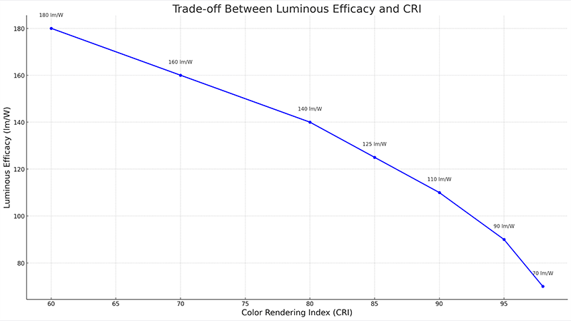
This is where a purchasing manager like you can really show your expertise. Understanding the nuances allows you to deliver the best value, not just the highest spec. The reality is that creating very high-CRI light involves a trade-off. The special phosphors used to achieve near-perfect color rendering can absorb a small amount of light, which slightly reduces the overall luminous efficacy (lumens per watt). This means a CRI 95 floodlight might produce slightly fewer lumens than a CRI 80 floodlight using the same amount of power. The cost is also higher.
So, the critical question is: does the application need perfect color? For a museum lighting up a famous painting, absolutely. The cost and efficiency trade-off is worth it. But for lighting up the side of a concrete warehouse? Probably not. A CRI 70 or 80 light will do the job perfectly well at a lower cost and higher efficiency.
Your job is about finding the sweet spot between performance, cost, and efficiency. For most of the commercial projects you handle, like office building exteriors, hotel landscapes, and public plazas, a CRI of 80+ is that sweet spot. It provides excellent color rendering that makes everything look great, without the premium cost and efficiency dip of a CRI 95+ light. You deliver a high-quality visual result while keeping the project on budget.
How Do CRI and Lumens Affect Each Other?
Many people evaluate lumens and CRI as two separate things. This is a mistake. It overlooks how they work together to create the perception of brightness and clarity in a space.
CRI and lumens don’t have a direct relationship, but they have a performance trade-off. Higher CRI can mean slightly lower lumens. More importantly, high-CRI light makes a space feel brighter and objects clearer, even at the same lumen output, because our eyes perceive the distinct colors better.
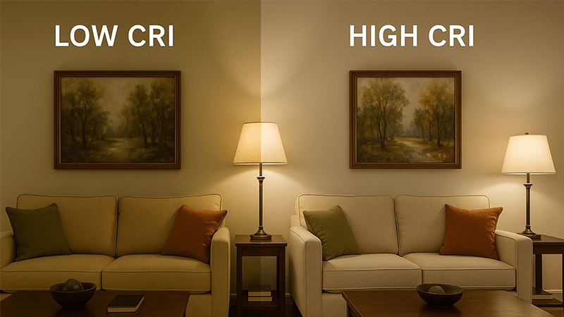
While there is often a slight engineering trade-off between efficacy and CRI, the more interesting relationship is in how our eyes experience the light. This is about "visual acuity". High-CRI light renders colors more distinctly, allowing our brains to process the scene more easily. We can distinguish shapes, textures, and details better. This increased clarity can make a space feel more comfortable and even appear brighter than a low-CRI space with the same measured lumen level.
I like to use the analogy of a TV. Imagine an old standard-definition TV next to a new 4K HDR television. If you measure the brightness of both screens with a light meter, they might be identical. But which one looks brighter, clearer, and more vivid? The 4K TV, of course. The incredible color and contrast make the image pop. High-CRI lighting does the exact same thing for the real world.
As a purchasing expert, this is a powerful concept you can use. When a project has a strict lumen requirement, you can propose a high-CRI solution. You can explain to your client or project manager that even if the lumens on the spec sheet are 5% lower, the superior light quality will deliver a better visual outcome. People will feel safer and more comfortable, and the property will look more high-end. This shows you are not just sourcing a product; you are providing an expert solution. It’s about delivering what my brand stands for: Lighting Quality You Can See.
Conclusion
Stop choosing LED floodlights based on lumens and watts alone. Make CRI a core metric to ensure the light quality matches your project’s standards for true-to-life color and visual appeal.