Last Updated on: December 10, 2025Struggling with harsh glare and uneven shadows from your ceiling lights? This can make even a beautiful space feel uncomfortable. It’s time to rethink your lighting plan for a seamless glow.
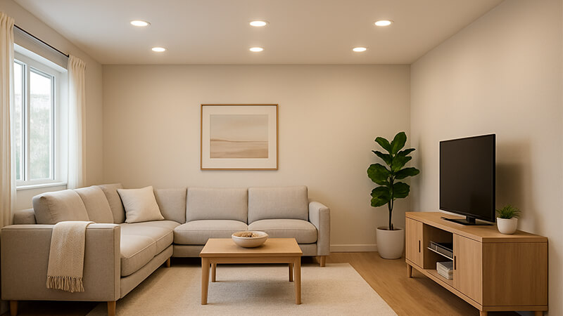
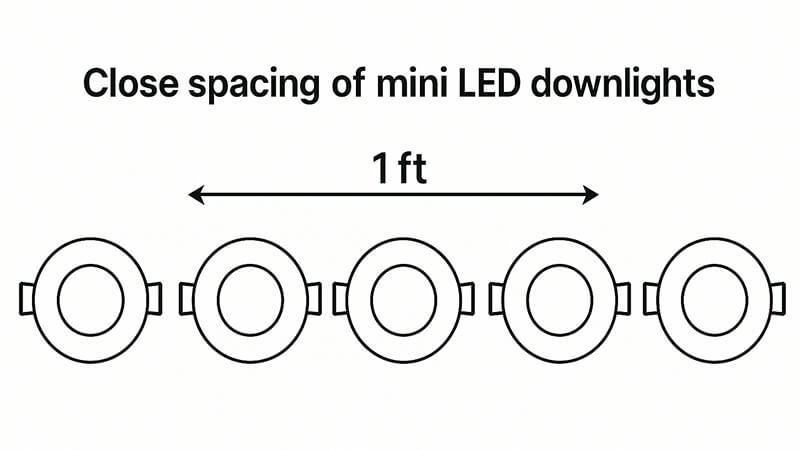
The best downlight layout uses many low-power mini LED downlights spaced closely, about 60-80cm apart. This method creates a uniform "light curtain" effect. It eliminates glare and dark spots, making the entire space feel naturally bright without any obvious, harsh light sources.

I’ve been in the lighting industry for a long time, starting on the factory floor. I’ve seen countless projects succeed or fail based on one thing: the layout. You can have the best quality lights in the world, but if they are placed incorrectly, the whole design falls apart. Many people just follow old rules that don’t apply to modern LEDs.
But there is a much better way to approach this. It’s a simple shift in thinking that can completely transform a room from being just "lit" to feeling naturally bright and welcoming. I want to share this strategy with you so your projects can truly shine. Let’s get into the details of how to achieve this perfect, seamless illumination.
What is the best layout for downlights?
You installed beautiful, high-quality downlights, but the room still has dark corners and harsh bright spots. This uneven lighting ruins the whole feel. A better layout solves this problem completely.
The best layout focuses on density, not power. Use double the number of downlights but at half the wattage. Space them much closer together, between 60 and 80 centimeters. This creates overlapping pools of soft light that wash away shadows for a smooth, even brightness.

The goal is to create what I call a "light curtain." Think of sunlight on a bright, overcast day. The light comes from everywhere and nowhere at once. There are no harsh shadows, and everything is perfectly visible. We can recreate this effect indoors. The old method used a few high-power downlights spaced far apart. This creates distinct, bright pools on the floor and leaves the areas in between darker. It’s an inefficient and uncomfortable way to light a space.
My approach is the opposite. By using a higher density of low-power lights, you ensure their light beams overlap significantly. Each mini downlight is only responsible for a small area. Its light blends perfectly with the light from its neighbors. You stop seeing individual light sources and just experience a complete, bright space. The room feels bigger, more open, and incredibly comfortable. There’s no glare, no sharp contrast, just pure, clean light. This is the secret to high-end architectural lighting.
The "More Lights, Less Power" Principle
This principle is the core of modern lighting design. Instead of blasting a room with a few powerful beams, we gently fill it with many small sources. This approach has several advantages. First, low-power mini LEDs are much less glaring. You can look up at the ceiling without squinting. Second, the close spacing eliminates the "scalloping" effect on walls, where you see arches of light. Instead, walls are washed evenly. Third, the energy consumption is often the same or even less, because you are using the light more efficiently to cover the entire area without dark spots.
Let’s compare the two methods directly.
Old Method vs. New Method
| Feature |
Old Method (High Power) |
New Method (Low Power) |
| Number of Lights |
Few |
Many (e.g., 2x) |
| Wattage per Light |
High (e.g., 15W) |
Low (e.g., 5W) |
| Spacing |
Wide (e.g., 1.5 – 2m) |
Close (e.g., 60 – 80cm) |
| Glare |
High |
Very Low / None |
| Shadows |
Hard and defined |
Soft or non-existent |
| Overall Feel |
Uneven, "stage-like" |
Uniform, natural, spacious |
| Wall Effect |
Visible "scallops" |
Even light wash |
I remember a client in the UAE, Shaz, who was struggling with a residential project. The architect specified four 18W downlights for the living room. It looked terrible. We convinced him to try sixteen 5W mini downlights instead. The total wattage was nearly the same, but the effect was night and day. The room felt calm and luxurious, not like an interrogation room. That project convinced him, and now he uses this method for all his high-end builds.
What is the best layout for ceiling lights?
You have a large, open-plan room and you’re not sure how to light it effectively. Using a single central fixture creates a bright middle but leaves the edges dark and gloomy.
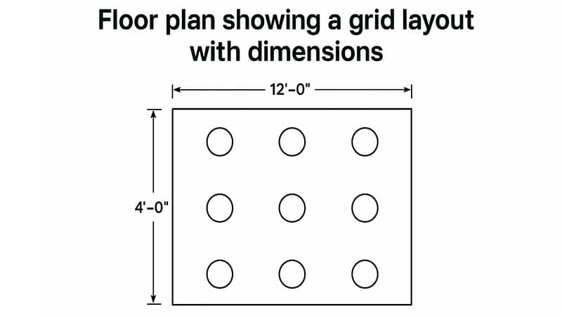
For general ceiling lighting, a grid layout is best. Create a uniform grid of low-power downlights or spotlights across the entire ceiling. This ensures every corner of the room receives the same quality and intensity of light, creating a balanced and functional space.

The best layout for ceiling lights depends entirely on the room’s function. We need to think in layers: ambient, task, and accent lighting. The grid layout I just described is for the ambient layer. This is your base layer of light, the foundation for everything else. It should be even, comfortable, and controllable, usually with a dimmer. This grid makes the room feel cohesive and provides a good general level of brightness for moving around and simple activities. I always recommend using the "more lights, less power" principle for this ambient grid.
Once your ambient grid is planned, you add other layers. For a kitchen, you would add task lighting under the cabinets to light the countertops. For a living room, you might add an accent light, like a track spot, pointed at a piece of art. Or you could hang a decorative pendant light over the dining table. These additional layers add depth, interest, and functionality. But they all build upon the foundation of a perfectly even ambient grid.
Layering Your Ceiling Lights
A professional lighting scheme is never just one type of light. It’s a careful combination of layers that work together. Here’s how to think about it for any room.
- Ambient Layer: This is your primary light source. It’s the grid of mini downlights we’ve been discussing. It provides the overall illumination for the room. The key here is uniformity and comfort. The goal is to eliminate shadows and create a welcoming base.
- Task Layer: This is focused light for specific activities. Think of reading lights by a chair, lights over a kitchen island, or lighting above a bathroom mirror. These lights are typically brighter than the ambient layer but are focused only on the work area to avoid creating glare elsewhere.
- Accent Layer: This is for aesthetics. Accent lights are used to highlight architectural features, artwork, or decorative objects. Wall washers, picture lights, and adjustable spotlights are common tools here. This layer creates visual interest and makes a space feel more dynamic and sophisticated.
Let’s look at a practical example for a living room.
| Layer |
Light Type |
Placement |
Purpose |
| Ambient |
5W Mini Downlights |
A grid with 80cm spacing across the ceiling. |
Provides a soft, even base light for the entire room. |
| Task |
Floor Lamp |
Next to the main sofa or armchair. |
Provides focused light for reading. |
| Accent |
Adjustable Spotlight |
On the ceiling, aimed at a painting on the wall. |
Draws attention to the artwork and adds depth. |
| Decorative |
Pendant Light |
Over a coffee table (if ceiling is high). |
Adds a decorative element and a warm focal point. |
By combining these layers, you create a lighting plan that is not only functional but also beautiful and flexible. You can turn on just the ambient layer for a relaxed feel, or add the task and accent lights when you need them. This control is what elevates a good lighting layout to a great one.
Should downlights be symmetrical?
You’re planning your layout and wonder if everything needs to be perfectly lined up. A strict symmetrical grid can sometimes look too rigid or clash with the room’s furniture and function.
Yes, for your base ambient lighting, the downlight grid should be symmetrical relative to the room’s architecture. This creates a clean, balanced look and ensures even light distribution. However, task and accent lights should be placed based on function, not symmetry.

Symmetry provides a sense of order and calm. When you look at a ceiling with a perfectly symmetrical grid of downlights, it feels intentional and well-designed. This grid forms your ambient layer, and its purpose is to wash the entire space in even, comfortable light. The symmetry of the grid ensures that this wash of light is perfectly balanced. It should be aligned with the walls, windows, and other key architectural features of the room. This creates a strong, clean foundation for your lighting design.
However, lighting design should not be a slave to symmetry. Once the ambient grid is set, all other lights should be placed where they are needed. A reading light goes next to the chair where you read. A pendant light goes over the center of the dining table. A spotlight points at the painting on the wall. These lights break the rigid symmetry of the grid. This contrast between the orderly ambient grid and the functionally placed task/accent lights is what makes a design feel dynamic and alive. If you tried to make every single light symmetrical, you would end up with lights in useless positions. The key is to know when to use symmetry and when to prioritize function.
Symmetry for Ambient, Function for a Task
Think of it like this: the symmetrical ambient grid is the canvas. The task and accent lights are the painting itself. The canvas needs to be straight and well-prepared, but the painting can be expressive and dynamic.
Let’s break down where symmetry matters most.
- Hallways & Corridors: Symmetry is crucial here. A straight, single or double line of downlights centered in the hallway creates a clear path and looks very clean.
- Square & Rectangular Rooms: A symmetrical grid is the standard and best practice for general ambient lighting. It ensures all areas get equal coverage.
- Kitchens: The ambient grid should be symmetrical. But the task lighting, like pendants over an island or lights under cabinets, should be positioned relative to the island and countertops, not the overall room’s center.
- Living Rooms: Start with a symmetrical ambient grid. Then, add your task and accent lighting based on your furniture layout. Don’t move a downlight from your grid just to be over a coffee table. Instead, add a new, different light fixture there.
Asymmetry as a Design Choice
In some very modern or creative designs, you might intentionally use an asymmetrical layout for the ambient lights. This can create a playful or dynamic effect. However, this is a very advanced technique and can easily look messy or accidental if not done by an experienced designer. For 99% of projects, especially in commercial or residential spaces where comfort and functionality are key, a symmetrical ambient grid is the right choice. It is timeless, effective, and provides the perfect foundation to build upon with other layers of light. I always advise my partners, like Shaz, to stick with a clean, symmetrical grid for the base layer. It’s a rule that ensures a good result every time.
How to arrange lights in a room?
You’re ready to create a lighting plan, but you’re facing an empty floor plan. Where do you even begin placing the first light to ensure the final result is perfect?
Start by creating a symmetrical grid for your ambient lighting. Measure the room’s length and width, then space low-power downlights evenly, about 60-80cm apart and about half that distance from the walls. Then, add task and accent lights based on the furniture layout.

Arranging lights is a step-by-step process. Don’t just place them randomly. I’ve developed a simple method over the years that ensures a professional result every time. The first and most important step is to ignore the furniture. For the base ambient layer, we only care about the room’s architecture—its walls, windows, and ceiling height. We create a perfect grid of light that evenly covers the entire empty space. This is your foundation. Once that grid is established, then you bring in the furniture plan and add the other layers of light—the task and accent lights—precisely where they are needed.
This method prevents common mistakes, like having a downlight directly over someone’s head when they sit on the sofa, which creates an annoying hotspot. Or having a dark corner because the lights were placed to align with a rug instead of the room itself. Your ambient lighting should be independent of your furniture arrangement. This also makes the space more flexible for the future. If the owner decides to rearrange the furniture, the room will still be perfectly lit.
A Step-by-Step Guide to Room Lighting
Let’s walk through the process for a typical rectangular room.
- Determine Your Spacing: For most rooms with a standard ceiling height (around 2.5-3 meters), I recommend a spacing of 60cm to 80cm between each mini downlight. This close spacing is key to the "light curtain" effect.
- Position the First Row: Your first row of downlights should be placed away from the wall. A good rule is to use half of your main spacing distance. So, if you are spacing your lights 80cm apart, your first row should be 40cm from the wall. This lights up the walls evenly and avoids creating harsh shadows or scallops at the top.
- Create the Grid: Once you have your first row placed 40cm from one wall, place the next row 80cm from that one, and so on across the room. Do the same in the other direction. This will create a perfect, symmetrical grid of points on your ceiling plan. This is where your ambient downlights will go.
- Place Task & Accent Lights: Now, overlay your furniture plan.
- Need light for reading in a corner chair? Add a floor lamp or a wall-mounted reading light there.
- Have a dining table? Center a pendant light directly over it.
- Want to highlight a bookshelf? Use a wall washer or a series of small, adjustable spotlights aimed at it.
- These lights are added in addition to the ambient grid, not as a replacement for any of its downlights.
This structured approach removes the guesswork. It ensures you have a beautiful, even base layer of light that makes the room feel great, plus highly functional task and accent lighting that makes the room work perfectly for its purpose. It’s a strategy I’ve shared with many clients, and it consistently delivers exceptional results.
Conclusion
The best downlight layout uses many low-power lights spaced closely. This creates a seamless, natural light curtain, making spaces feel comfortable and look premium. Always build from this foundation.