Struggling to choose kitchen lights? The wrong choice can make your food look dull and your space feel unwelcoming. I’ll share the secret to lighting that elevates your entire kitchen experience.
The best LED downlights for a kitchen are those with a high Color Rendering Index (CRI) of 90+, a color temperature of around 4000K for task areas, and strategic placement. It’s not about the light you see, but how it makes your food and space look and feel.
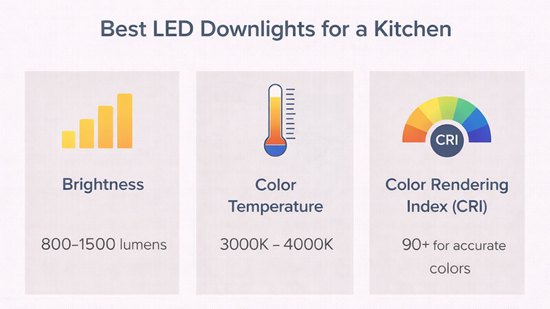
Most people focus on watts and color temperature when buying lights. They think the job is done if the kitchen is bright. But after years of manufacturing lights and helping clients like Shaz, a purchasing manager from the UAE, I’ve learned a core secret. The best kitchen light isn’t the one you "see." It’s the light that makes the food, your countertops, and even you look your best. My philosophy is simple. Don’t just choose lights to "light up the kitchen." Design the light to "optimize your experience and the appearance of food" within it. Let’s dive into how you can do this.
What type of LED light is best for a kitchen?
You see countless LED types and feel lost. Choosing the wrong one means you get poor light quality, and you might have to spend more to fix it later.
The best type of LED light for a kitchen is a downlight with a high Color Rendering Index (CRI) of 90 or more. This ensures colors, especially of fresh food, look vibrant and true. Also, consider lights with good glare control to ensure they are comfortable to work under.
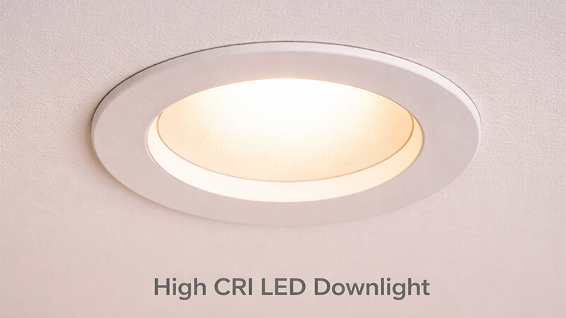
When people ask me about the "type" of light, they usually mean the shape. But I encourage them to think about the quality of the light itself. The most important specification for a kitchen is the Color Rendering Index, or CRI. CRI is a scale from 0 to 100 that measures how accurately a light source shows the true colors of an object. Sunlight has a CRI of 100.
I remember a client, a project contractor, who installed standard CRI 80 downlights in a new restaurant kitchen. He called me, frustrated. "Michael," he said, "the red bell peppers look brownish, and the lettuce looks pale. The chef is not happy." We replaced the fixtures with our CRI 95 downlights. The change was instant. The peppers were a vibrant red, and the greens looked fresh and crisp. This is the power of high CRI. It makes food look appetizing. For any kitchen, residential or commercial, never settle for less than CRI 90.
CRI: The Secret to Appetizing Food
| CRI Value |
Effect on Food Colors |
Recommended Use |
| CRI 80-85 |
Colors look muted and slightly distorted. Reds and browns can merge. |
Acceptable for hallways or storage, but not recommended for kitchens. |
| CRI 90+ |
Colors appear natural, vibrant, and true to life. |
Essential for kitchen task areas where food is prepared and cooked. |
| CRI 95+ |
Excellent color fidelity. Renders subtle shades and textures accurately. |
Ideal for high-end residential kitchens, grocery displays, and restaurants. |
Beyond CRI, consider glare. A light with a Unified Glare Rating (UGR) below 19 is more comfortable for your eyes. You can work for hours without straining. So, the best "type" isn’t just a downlight. It’s a high-CRI, low-glare downlight.
Is 4000K or 6500K better for kitchens?
The 4000K versus 6500K debate is common for kitchens. Pick the wrong one, and your kitchen can feel like a cold, sterile laboratory, making food look unappealing.
For almost all kitchens, 4000K is far better than 6500K. 4000K provides a clean, neutral white light that is excellent for tasks and renders colors accurately. 6500K is a very cool, bluish light that can feel harsh and make food, especially meats and baked goods, look pale.
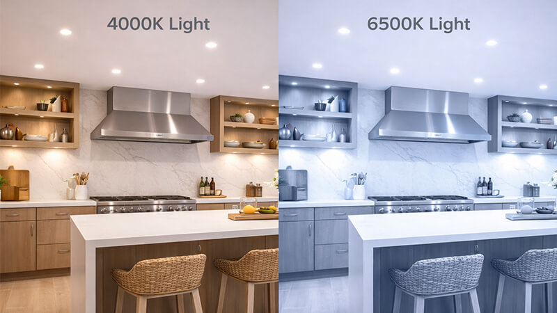
Let’s break down color temperature, measured in Kelvin (K). Think of it as the color of the light itself. A low Kelvin value (like 2700K) is warm and yellowish, like a candle. A high Kelvin value (6500K) is very cool and bluish, like a clear sky.
In my early days in manufacturing, we supplied 6500K lights for a commercial bakery project. The client thought brighter and "whiter" was better. It was a mistake. The golden-brown croissants looked pale and sickly under the blue-tinted light. Sales were affected until we replaced them all with 4000K fixtures. The warm, golden appearance of the baked goods returned immediately.
4000K is the sweet spot for task areas in a kitchen. It’s clean and clear, helping you see precisely while you chop vegetables or read a recipe. It keeps you alert without the clinical, sterile feeling of 6500K. The harsh blue tones of 6500K light can significantly distort food colors. It might have a place in an industrial setting where maximum alertness is the only goal, but for any kitchen where the appearance of food matters, 4000K is the superior choice.
4000K vs. 6500K: A Direct Comparison
| Feature |
4000K (Neutral White) |
6500K (Cool/Daylight White) |
| Color Tone |
Clean, balanced white. No strong yellow or blue tint. |
Very cool white with a noticeable blue tint. |
| Atmosphere |
Modern, focused, and clean. Keeps you alert but comfortable. |
Sterile, clinical, and industrial. Can feel harsh and unwelcoming. |
| Effect on Food |
Renders most food colors accurately. Great for fresh produce. |
Washes out warm tones. Makes meats, bread, and pastries look unappetizing. |
| Best For |
Kitchen task lighting (countertops, sink), garages, offices. |
Hospitals, warehouses, and industrial applications. Not recommended for homes. |
Is 3000K or 4000K better for kitchen?
You might be stuck between a warm, cozy feel and a clean, neutral one. One feels too relaxed for cooking, while the other might feel a bit too functional for dining.
The best solution is often to use both. Use 4000K for task lighting directly over countertops and the sink. Use 3000K for ambient and dining areas to create a warm, inviting atmosphere. This strategy, called layering, gives you the best of both worlds.
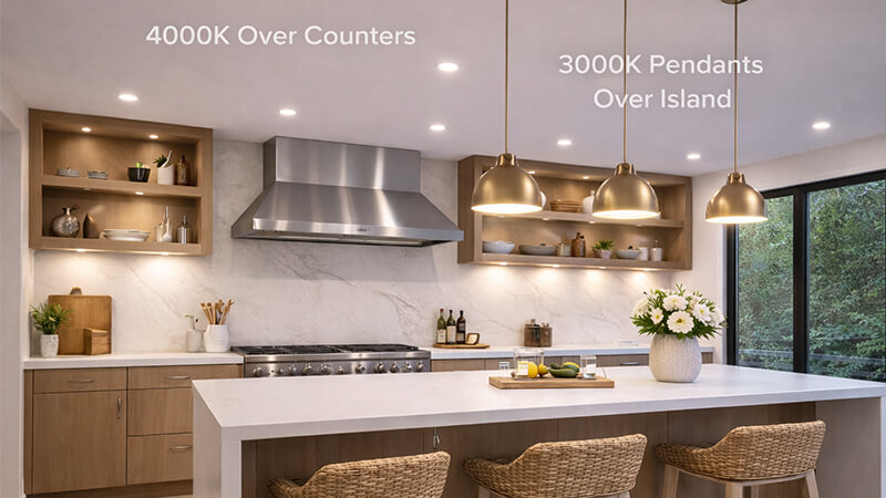
There isn’t one single answer here. The choice between 3000K and 4000K depends entirely on the kitchen’s design and how you use the space. As a manufacturer, I’ve seen clients succeed with both. But the most successful projects use a layered approach. They don’t choose one or the other; they use both strategically.
I worked with Shaz, the purchasing manager, on a large residential project in the UAE. The kitchens had large islands that doubled as both a prep space and a family dining spot. The designers were worried 4000K would feel too cold for dinner, but 3000K wasn’t bright enough for food prep. I suggested a two-circuit solution. We installed 4000K high-CRI downlights directly above the countertop perimeter for task lighting. Then, we hung beautiful decorative pendants with 3000K bulbs over the island. The family could switch on the 4000K lights for cooking and then switch to the warm 3000K pendants for a relaxed, cozy dinner. It was a huge success.
Layering 3000K and 4000K
| Light Temperature |
Best Location in Kitchen |
Primary Function |
Mood Created |
| 4000K (Neutral White) |
Over countertops, stove, and sink. |
Task Lighting: For chopping, cooking, and cleaning. |
Focused, alert, clean, and modern. |
| 3000K (Warm White) |
Over a dining table, island seating, or as general ambient light. |
Ambient/Accent Lighting: For dining and socializing. |
Cozy, warm, relaxed, and inviting. |
If you have to choose only one color temperature for the entire kitchen, consider your cabinets and overall style. 4000K works wonderfully with modern, white, or gray kitchens. 3000K pairs beautifully with traditional kitchens that have warm wood cabinets. But for ultimate functionality and mood control, layering is always the best path.
What is the best brightness for LED lights in a kitchen?
You worry about making your kitchen too dim or uncomfortably bright. Just looking at the wattage of a bulb doesn’t tell you the whole story about brightness.
The best brightness is measured in lumens, not watts. For a kitchen, aim for 30-40 lumens per square foot for ambient lighting and 70-80 lumens per square foot for task areas like countertops. This ensures the space is functional without being harsh.
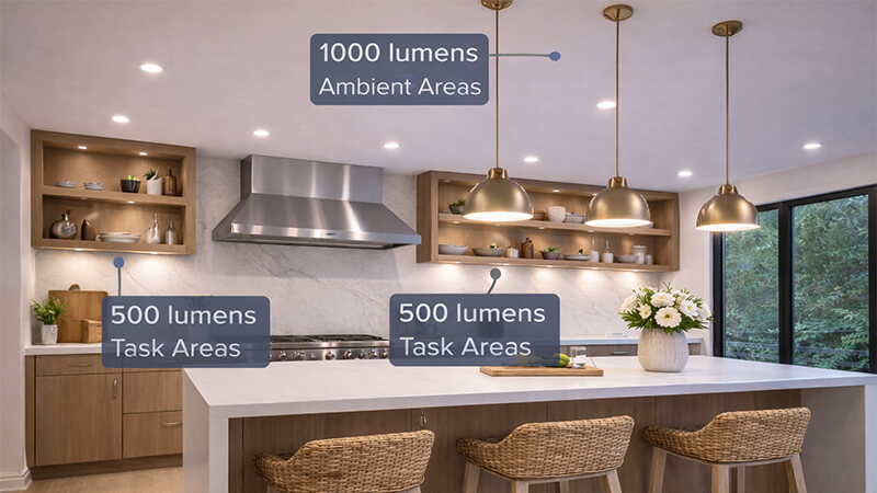
Let’s stop thinking about watts. Wattage tells you how much energy a bulb uses, not how much light it produces. The real measure of brightness is lumens. To light your kitchen properly, you need to calculate the total lumens required. It’s simpler than it sounds.
First, measure your kitchen’s area. For a 10-foot by 15-foot kitchen, the area is 150 square feet.
Next, decide on the brightness level for different zones.
- Ambient Lighting (General illumination): This is the light that fills the whole room. You need about 30-40 lumens per square foot.
- Task Lighting (Focused illumination): This is the bright light over your counters, sink, and stove. Here, you need much more: about 70-80 lumens per square foot.
Let’s apply this to our 150 sq. ft. kitchen example.
- Ambient Need: 150 sq. ft. x 40 lumens = 6,000 lumens.
- Task Area (e.g., 50 sq. ft. of counter space): 50 sq. ft. x 80 lumens = 4,000 lumens.
This doesn’t mean you need 10,000 lumens total. The task lighting contributes to the ambient light. A good strategy is to meet the ambient need with general downlights and then add more focused downlights or under-cabinet lights to boost the lumens in your task zones.
Simple Lumen Calculation Guide
| Lighting Layer |
Lumens per Square Foot |
Example: 150 sq. ft. Kitchen |
How to Achieve It |
| Ambient |
30-40 lm/sq. ft. |
4,500 – 6,000 lm |
6-8 downlights, each providing 700-800 lumens. |
| Task |
70-80 lm/sq. ft. |
3,500 – 4,000 lm (for a 50 sq. ft. task area) |
Focused downlights directly over counters or LED strip lights under cabinets. |
My advice is always to install dimmers. This is non-negotiable for kitchens. It allows you to have bright, functional light when you’re cooking and a softer, more relaxed light when you’re just grabbing a late-night snack. Brightness isn’t about one fixed number; it’s about having the flexibility to adapt the light to your activity.
Conclusion
Choose kitchen lights with high CRI, layered color temperatures, and adjustable brightness. This ensures your food looks great, and your kitchen is perfect for both cooking and living.