Struggling with spec sheets? Choosing the wrong CRI can make a beautiful space look dull and lifeless. Understanding what CRI truly means helps you select the perfect light for every project.
The Color Rendering Index (CRI) is a scale from 0 to 100. It measures how accurately a light source reveals the true colors of objects compared to a natural light source like the sun. A higher score means more accurate colors.
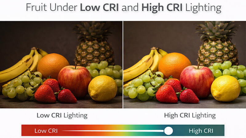
You’ve probably been told that a higher CRI number is always the better choice. It seems simple, right? More is better. But in my years of manufacturing LEDs, I’ve learned a crucial lesson: the spec sheet doesn’t tell the whole story. The real power of CRI isn’t just about showing "true" colors; it’s about controlling how a space feels and what stands out. Thinking this way will change how you approach every lighting project, saving you money and delivering results that truly impress your clients. Let’s look beyond the numbers.
Is a higher CRI always better?
Everyone says to buy the highest CRI light you can afford. But this advice often leads to overspending on projects where the difference is barely noticeable, hurting your budget and your bottom line.
Not always. A higher CRI is critical for color-sensitive tasks, like in retail stores or art galleries. For most general home or office applications, a CRI of 80 is often sufficient. It provides good color quality and is much more cost-effective than CRI 90+ options.
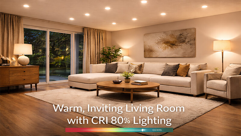
In the lighting industry, we get focused on technical specs. But the real purpose of CRI isn’t just to "reproduce reality." It’s to influence emotion and perception. I believe its true role is to highlight what needs to be seen. Think about it: our eyes are not machines. We are biologically programmed to be extremely sensitive to certain colors, especially those related to skin tones and food. A healthy complexion or a fresh piece of fruit is something our brains are wired to analyze. This is where CRI 90+ shines. For other objects, like a blue sofa or a grey countertop, the difference between CRI 80 and CRI 90 is almost impossible to see. I remember working with a restaurant owner who was hesitant about the extra cost of CRI 90 lighting. I set up a demo for him. We lit the same plate of food, a steak with fresh vegetables, first with a CRI 80 downlight and then with a CRI 90. The difference was instant. Under the CRI 90 light, the steak looked richer, and the greens were more vibrant. The food didn’t just look "real"; it looked more desirable. He understood immediately. The light was helping him sell the food.
When to Choose CRI 80 vs. CRI 90+
| Application |
Recommended CRI |
Why It Matters |
| Hallways, Garages, Storage |
CRI 80+ |
Cost-effectiveness is key. Color accuracy is not the primary concern in these functional spaces. |
| Living Rooms, Bedrooms |
CRI 80+ or 90+ |
CRI 80 is perfectly fine for general use. CRI 90+ can be a premium upgrade to make wood tones richer and skin look healthier. |
| Kitchens, Dining Rooms |
CRI 90+ |
This is crucial. It makes food look more appetizing and fresh, which enhances the entire dining experience. |
| Bathrooms (especially vanities) |
CRI 90+ |
Essential for rendering accurate skin tones. This is very important for tasks like applying makeup. |
| Retail (Fashion, Furniture, Art) |
CRI 95+ |
Absolutely essential. True and vibrant colors are needed to showcase products properly and drive sales. |
What makes an LED high CRI?
You know you need high CRI, but you don’t understand what makes one LED different from another. This lack of knowledge can make you too dependent on supplier claims, risking poor quality.
A high CRI is achieved by using higher-quality phosphors. These materials are coated on the blue LED chip and convert the blue light into a fuller spectrum of light. This mix includes more deep red tones, which are often missing in standard, lower-CRI LEDs.
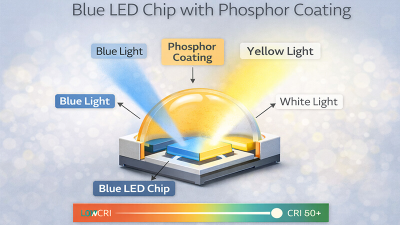
To understand what makes an LED high CRI, you have to look at how an LED is made. It all starts with a small blue LED chip. By itself, this chip only produces an intense blue light. To get white light, we coat this chip with a layer of material called phosphor. When the blue light hits the phosphor, it gets converted into other colors like green, yellow, and red. The combination of these colors is what we see as white light. The quality of that white light depends entirely on the quality and composition of the phosphor mix.
The Role of the Phosphor
Think of it like this: a low-CRI LED is like a painter who only has a few basic paint colors. They can make a picture, but it will lack depth and richness. A high-CRI LED is like a painter with a full palette of colors, including many different shades. They can create a much more vibrant and lifelike image.
In the factory, I see this difference up close. A standard CRI 80 LED uses a common, cost-effective phosphor. It does a good job, but its light spectrum has gaps, especially in the deep red range. For a high-CRI LED, we use a more complex and expensive blend of phosphors. These advanced phosphors are specifically designed to fill in those gaps. In particular, they add more red light back into the spectrum. This is critical because many things, from natural wood to human skin, rely on red tones to look rich and healthy. This is also why high-CRI LEDs cost more to produce—the materials are simply more advanced. When you are sourcing products, don’t just ask for the CRI (which is technically called Ra). Also ask for the R9 value. R9 is a specific score that measures how well the light renders deep red. It’s not part of the main CRI score, but a good R9 value (ideally above 50) is the true sign of a quality high-CRI light.
Is there a big difference between CRI 80 and 90?
You see CRI 80 and CRI 90 options for a project and wonder if the extra cost is justified. Making the wrong choice can mean wasting 30% of your lighting budget for a difference nobody sees.
For most objects, the visual difference is very small. The real difference is how they render skin tones and food. CRI 90 lights make skin look healthier and food more appetizing because they reproduce red colors much more accurately than CRI 80 lights.
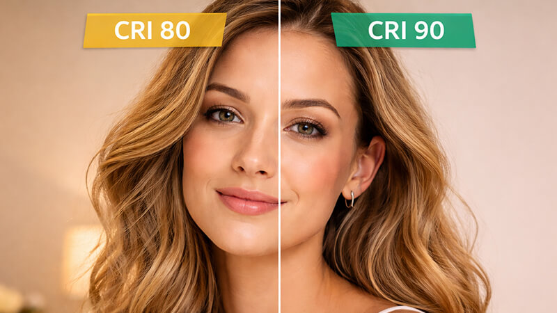
This is one of the most important questions a purchasing manager like Shaz can ask. Here is the honest answer I’ve learned from years of manufacturing and client feedback: in most situations, the visual difference between a CRI 80 and CRI 90 light is less than 3%. However, the cost increase to go from 80 to 90 is often over 30%. This is a huge gap. So, is it worth it? It depends entirely on what you are lighting. For most of the objects in a room—a desk, a chair, a carpet—your eyes will not notice the difference. But for two things, the difference is clear: human skin and food.
Where the Difference Really Matters: Skin and Food
Our eyes have evolved to be highly sensitive to the color of skin to judge health and emotion. We are also experts at judging the color of food to see if it’s ripe and safe to eat. Both of these depend heavily on red tones. This is where CRI 80 lights fall a bit short; they often have a poor R9 (red rendering) value. This can make a person’s face look slightly pale or washed out. It can make a red apple look a bit dull. A CRI 90 light, with its superior phosphor mix, fills in these red tones. It makes skin look warm and healthy. It makes food look fresh and delicious. I had a client who installed CRI 80 lights throughout his new home. A few months later, he asked me to come back and only change the lights in two places: the master bathroom vanity and the kitchen island. He and his wife found that her makeup looked different in the bathroom mirror than it did outside, and their home-cooked meals looked less appealing on the island. We swapped just those few downlights for CRI 90 versions. The problem was solved. This taught me a valuable lesson: CRI 90 is a precision tool. You don’t use it everywhere. You use it where that small, subtle difference in color has a big psychological impact.
CRI 80 vs. CRI 90: A Practical Comparison
| Feature |
CRI 80 Downlight |
CRI 90 Downlight |
| Visual on General Objects |
Good. Colors look clear and are easily recognizable. |
Excellent. Colors are slightly more saturated and vibrant. |
| Visual on Skin Tones |
Acceptable. Can sometimes look slightly pale or flat. |
Excellent. Looks healthy, warm, and completely natural. |
| Visual on Red Items/Food |
Fair. Reds can appear slightly muted or even orange-ish. |
Excellent. Reds are deep, rich, and true to life. |
| Cost |
Baseline Standard |
~30% Higher or More |
| Best Use Case |
Offices, hallways, garages, budget-conscious projects. |
High-end homes, kitchens, restaurants, bathrooms, retail. |
What is a good CRI score?
You want a simple rule to follow for what CRI score to choose. But a single "good" number doesn’t exist, and using one can lead to poor lighting choices and unhappy clients.
A "good" score depends entirely on the application. CRI 80+ is the modern standard for good general lighting. CRI 90+ is excellent for spaces where color matters. CRI 95+ is professional-grade, needed only for color-critical work like in art galleries or print shops.
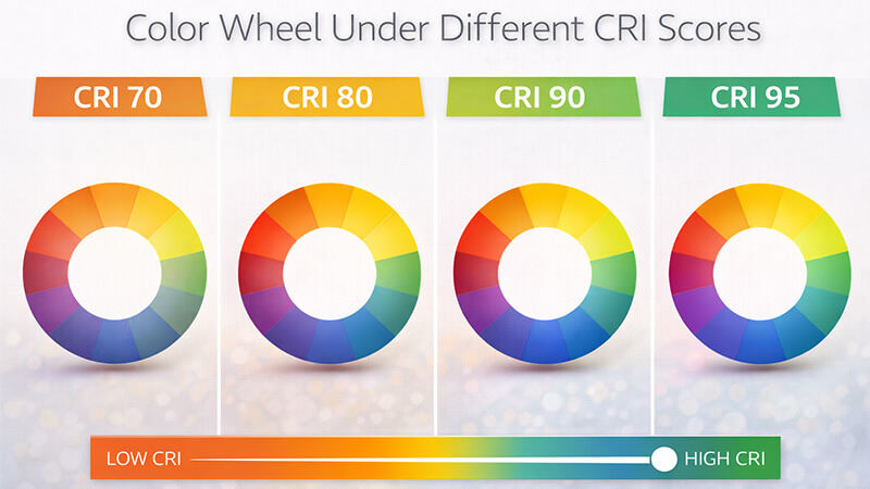
There is no single "good" CRI score, only the "right" CRI score for the job. Choosing the right one is the mark of an expert. The goal is not to blindly chase the highest number. The goal is to use light to make the important things in a space come alive. When I work with a project contractor or a designer like Shaz, we don’t start with numbers. We start by asking: what needs to be seen in this room? Is it a family’s faces around the dinner table? Is it the texture of wood flooring? Is it the vibrant color of children’s paintings on the wall? The answer to that question tells us what CRI we need. My insight is that good light "wakes up" the color in specific objects.
Matching CRI to Your Project’s Needs
Here is a simple guide I use to help my partners choose.
- CRI 70 and Below (Poor): In today’s market, this is no longer acceptable for almost any indoor application. Colors look distorted and washed out. The light often feels sterile and unpleasant. This might only be used for basic outdoor street lighting where color rendering is not a factor.
- CRI 80-89 (Good): This is the workhorse of the modern lighting industry. It provides a good quality of light that is suitable for the vast majority of spaces, including offices, schools, and most areas in a home. It represents the perfect balance between good color quality and affordable cost. For 90% of applications, this is the right choice.
- CRI 90-94 (Excellent): This is the premium choice. You will see a noticeable improvement in the richness of colors, especially reds, warm wood tones, and skin. This is ideal for high-end homes, restaurants, hotels, and retail environments where you want to create a luxurious and inviting atmosphere.
- CRI 95+ (Professional / Color-Critical): This is the highest level of color accuracy available. It’s reserved for spaces where making precise color judgments is essential. Think of art galleries, museums, printing shops, and medical examination rooms. Here, the light must be as close to perfect as possible. I once worked with a client sourcing for a high-end fashion boutique. He insisted on CRI 95+ track lights. He knew that the subtle differences in the shades of leather and fabric could only be seen under perfect light. That choice helped his client sell more products. That’s the power of picking the right CRI.
Conclusion
CRI is more than a technical number. It’s a tool. Use CRI 80 for cost-effective, general lighting, and use CRI 90+ strategically to enhance colors that create an emotional impact.