Struggling with downlight colors? The wrong choice can make a perfect design feel off. I’ll show you how to select the right color to enhance your space perfectly.
The best color for downlights depends on the room’s purpose. Warm white (2700K-3000K) creates a cozy feel for living spaces. Neutral white (4000K) is ideal for kitchens and offices. Cool white (5000K+) suits garages and commercial areas where task visibility is key.
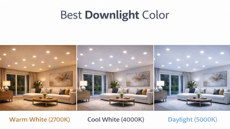
For years, I’ve seen clients debate warm versus cool white as if one is universally better. But after manufacturing millions of downlights at iPHD, I’ve learned that’s the wrong question. My insight is simple: the color itself is meaningless without context. It’s about how light interacts with the space and the people in it. To truly master downlight selection, we need to break this down further. Let’s start by looking at what really determines the right color choice.
What color should downlights be?
Unsure which color temperature to choose for a project? A wrong pick can lead to unhappy clients and costly fixes. The secret is matching the light to the room’s function.
Downlight color, or color temperature, should match the room’s activity. Use warm tones (2700K-3000K) for relaxation areas like bedrooms. Neutral tones (3500K-4000K) are for active spaces like kitchens. Cool tones (5000K+) are for high-focus task areas like workshops or commercial settings.
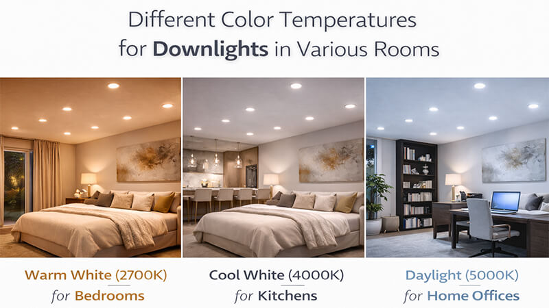
To get this right, you need to understand two key things: Color Temperature (CCT) and Color Rendering Index (CRI). People often focus only on CCT, but that’s just half the story.
CCT is measured in Kelvin (K). Think of it like heating a piece of metal. At a lower temperature, it glows a warm, reddish-orange. As it gets hotter, it turns a neutral white, and then a bluish-white. LED lighting mimics this spectrum. Lower Kelvin numbers (2700K) mean warmer, yellower light. Higher numbers (5000K) mean cooler, bluer light.
Matching CCT to Room Function
The "best" CCT is all about the activities that happen in a room. You wouldn’t use the same lighting in a bedroom as you would in a factory. Here is a simple guide I use for my clients’ projects.
| Room Type |
Recommended CCT |
Mood & Function |
| Living Room / Den |
2700K – 3000K |
Cozy, relaxing, inviting |
| Kitchen / Laundry |
3500K – 4500K |
Bright, clean, task-oriented |
| Bathroom |
3000K – 4000K |
Clean, flattering, functional |
| Bedroom |
2700K – 3000K |
Calm, restful, intimate |
| Home Office / Garage |
4000K – 5000K |
Focused, alert, productive |
A Note on CRI
Now for the part that separates good from great lighting: CRI. Color Rendering Index tells you how accurately a light source shows the true colors of objects. CCT is the color of the light itself; CRI is how that light makes other colors look. I remember a project for a boutique clothing store. The owner chose the correct 3000K CCT. But he sourced cheap downlights with a low CRI of 70. His vibrant clothes looked dull and washed out. We replaced them with our 95+ CRI downlights, and the merchandise suddenly popped with color. For any project where color accuracy matters, like retail or high-end homes, a CRI of 90+ is non-negotiable.
Want to make a space feel truly attractive? "Attractive" is subjective and can clash with your design. The secret is choosing a light that complements the existing colors and materials.
The most "attractive" LED color is typically warm white (around 2700K-3000K) because it mimics traditional incandescent bulbs and candlelight, creating a welcoming and intimate atmosphere. It enhances warm materials like wood and brings out flattering skin tones, making spaces feel like home.
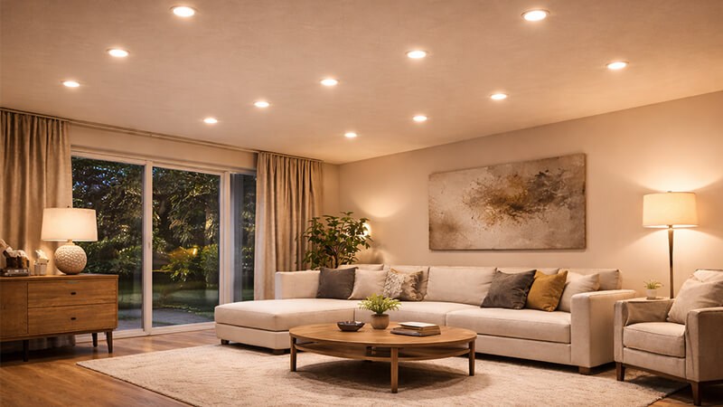
While warm light is often seen as the most attractive, this isn’t a universal rule. The attractiveness of a light color is directly tied to the environment it’s in. The goal is harmony between the light and the materials in the room.
The Psychology of Warm Light
Warm light is popular for a reason. Psychologically, we associate it with the sun, fire, and candlelight. These light sources signal safety, comfort, and relaxation. This is why 2700K-3000K light is so effective in living rooms, bedrooms, and restaurants. It makes people feel at ease and encourages them to stay longer. It creates a sense of intimacy and connection.
When Cool Light is "Attractive"
But what about a modern, minimalist space? I recently worked with a designer in the UAE on a villa with white marble floors, chrome fixtures, and grey furniture. The initial request was for 3000K downlights. I sent samples of both 3000K and 4000K. In that space, the 3000K warm light made the pristine white marble look slightly yellow and dated. But the 4000K neutral light made it look brilliant, crisp, and clean. It enhanced the modern aesthetic. In this context, the cooler light was far more "attractive" because it was honest to the materials.
The Role of Finishes and Materials
The light must serve the design. You have to consider how the light’s color will interact with the paint, flooring, and furniture. A purchasing manager like yourself, Shaz, needs to be able to guide clients on this. This table shows how different materials react to light.
| Material / Finish |
Best with Warm Light (2700K-3000K) |
Best with Neutral/Cool Light (3500K-5000K) |
| Wood (Oak, Pine, Cherry) |
Enhances natural warmth and grain. |
Can wash out the color, making it look dull. |
| Stone (Marble, Granite) |
Warm tones give a classic, cozy feel. |
Cool tones create a crisp, modern, clean look. |
| Metals (Brass, Copper) |
Highlights the rich, warm luster. |
Can look flat or overly sterile. |
| Metals (Chrome, Steel) |
Can look yellowed or dated. |
Emphasizes the sleek, reflective, modern quality. |
| Paint Colors (Reds, Oranges) |
Makes them appear richer and more vibrant. |
Mutes their intensity, making them look flat. |
| Paint Colors (Blues, Greens) |
Can make them look muddy or dull. |
Makes them appear truer and more crisp. |
How to arrange downlights in a room?
Got the perfect downlights but unsure about placement? Bad spacing creates glare and dark corners, ruining the effect. Let’s use a simple formula to achieve balanced, professional lighting.
For general lighting, space downlights evenly. A good rule is to divide the ceiling height by two to get the distance between each downlight. For an 8-foot ceiling, space them about 4 feet apart. Keep them 2-3 feet away from walls to avoid harsh shadows.
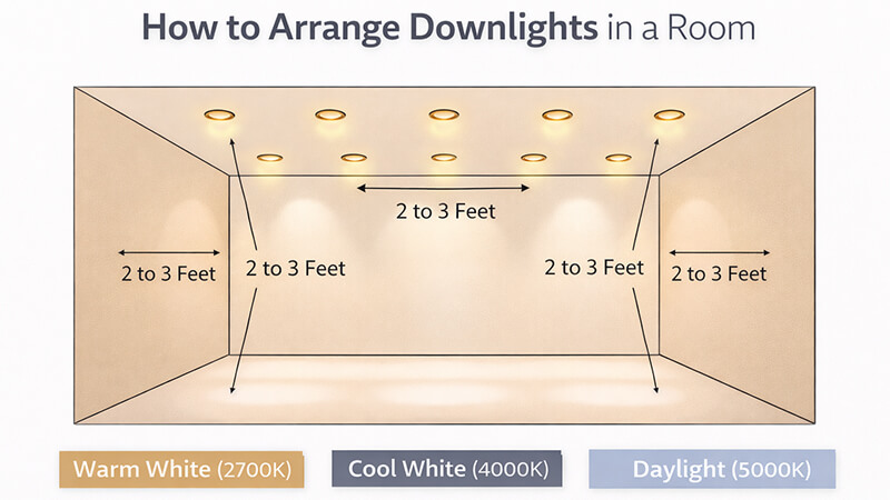
That simple formula is a great starting point for general ambient lighting, but stopping there is a common mistake. Truly great lighting design is about creating layers. A uniform grid of downlights can make a room feel flat, like an office or an airport runway. We need to think about what we want to achieve in the space.
The General Lighting Formula
Let’s start with the basics. For an even layer of ambient light, the formula works well:
Spacing = Ceiling Height ÷ 2
So, for a 9-foot (2.7m) ceiling, you would space your downlights about 4.5 feet (1.35m) apart. You should also keep them about 2-3 feet (0.6-0.9m) from the walls. This prevents ugly "scallops" of light and harsh shadows on the wall surfaces. But this is just your base layer.
Layering with Task and Accent Lighting
To bring a room to life, you add more layers.
- Task Lighting: This is focused light for specific activities. In a kitchen, place downlights directly over the countertops, not in the central walkway. This puts the light where the work is done and prevents your own body from casting a shadow. Use downlights with a narrower beam angle (e.g., 24° or 36°) for this.
- Accent Lighting: This is used to create visual interest. Use adjustable downlights (gimbals) to highlight a piece of art, a textured stone wall, or bookshelves. This technique, called "wall washing" or "spotlighting," adds depth and drama to a room. It draws the eye and makes the space feel more sophisticated.
Common Placement Mistakes to Avoid
I helped redesign a hotel lobby where the original plan was a simple grid. It looked sterile. We changed it by grouping downlights over the reception desk and seating areas, then used accent lights to highlight artwork. The space was transformed. Here are the mistakes we fixed:
| Mistake |
Why It’s Bad |
The Solution |
| Grid-like "Airport Runway" |
Creates a flat, boring, and institutional look. Lacks focus. |
Use a layered approach. Group lights over functional zones instead of a uniform grid. |
| Too Close to Walls |
Creates harsh, scalloped shadows and "hot spots" on the wall. |
Place downlights at least 2-3 feet (0.6-0.9m) from the wall for general lighting. |
| Ignoring Task Areas |
Leaves important zones like kitchen counters in shadow. |
Position dedicated downlights directly above countertops, sinks, and desks for focused, shadow-free light. |
| Using Only Downlights |
Relies on a single source, which can feel harsh and one-dimensional. |
Combine downlights (ambient) with other fixtures like pendants (task) and lamps (accent) for a balanced room. |
What color light is most flattering?
Ever feel like your bathroom lighting is working against you? Bad light can make you look tired and sick. The key to flattering light is the right color and direction.
The most flattering light for skin tones combines a warm color temperature (2700K-3000K) with a high Color Rendering Index (CRI) of 90+. This combination renders skin tones accurately and warmly, minimizing blemishes and creating a healthy, vibrant glow, much like the "golden hour" of sunlight.

Creating flattering light is crucial in spaces like bathrooms, dressing rooms, and even restaurants. It’s not just about making people look good; it’s about making them feel good. It’s a combination of the right color, quality, and direction.
The Magic of High CRI
I’ve mentioned CRI before, but for flattering light, it’s the most important factor. Skin tones are complex, with many subtle shades of red, pink, and yellow. A light with a low CRI cannot render these colors accurately. It makes skin look flat, pale, or even greenish. A high CRI of 90+ ensures that the light reveals the true, healthy tones of the skin. For the best results, I always specify products with a high R9 value (over 50). R9 is a specific measure of how well a light renders deep red, which is critical for natural-looking skin.
The Importance of Light Direction
Equally important is the direction of the light. A single downlight directly over a mirror is the worst possible choice. It creates harsh shadows under the eyes, nose, and chin. This is what we call "monster lighting" in the industry because it’s how scary characters are lit in movies. Flattering light must come from the front and sides, at face level. This fills in the shadows and illuminates the face evenly.
Application in Different Spaces
So how do you create this in a practical setting like a bathroom? You use layers.
- Ambient Light: Start with a general downlight in the center of the room for overall illumination.
- Task/Vanity Light: This is the key. Instead of a light above the mirror, install vertical fixtures or sconces on both sides of the mirror. This cross-illumination is the secret to shadow-free, flattering light.
Here are the ideal specifications for a project that demands flattering light:
| Lighting Element |
Specification |
Purpose |
| Source |
LED |
Energy efficient, long life, excellent color quality. |
| Color Temperature |
2700K – 3000K |
Provides a warm, healthy glow similar to candlelight. |
| Color Rendering (CRI) |
90+ (with R9 > 50) |
Accurately renders skin tones, making them look natural and vibrant. |
| Direction |
Frontal & Side (e.g., Sconces) |
Eliminates harsh overhead shadows on the face. |
| Dimming |
Dimmable |
Allows user to adjust light levels for mood or task. |
Conclusion
The best downlight color is not one-size-fits-all. It’s a strategic choice based on room function, desired mood, and how it interacts with the space and the people within it.