Last Updated on: November 21, 2025Struggling with the right downlight color? The wrong choice can ruin a room’s mood and feel uncomfortable. You need a simple, reliable answer for your projects.
For a safe, versatile choice that works almost anywhere, 3000K is an excellent option. It creates a warm, inviting atmosphere that is also bright enough for general tasks. For a more tailored approach, use 3000K in living areas and 4000K in task-oriented spaces like kitchens.
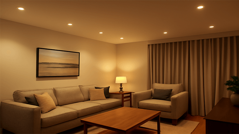
This is one of the most common questions I hear from partners like Shaz, who manage large lighting projects. Choosing the right color temperature is critical. It can make or break a design. The "best" choice isn’t a single number; it depends on the room and the feeling you want to create. But don’t worry, it’s not as complicated as it seems. Let’s walk through it together. I’ll share what I’ve learned from years of manufacturing and helping clients light their spaces perfectly.
What is the best color temperature for LED lights?
Feeling overwhelmed by all the color options for LEDs? Choosing the wrong one can make a perfect design feel cold or dingy. You need a simple, practical guide.
The best color temperature depends entirely on the room’s purpose. Use 2700K-3000K (Warm White) for relaxing. Use 3500K-4000K (Neutral White) for tasks. Use 5000K+ (Daylight) for areas needing high focus and detail.
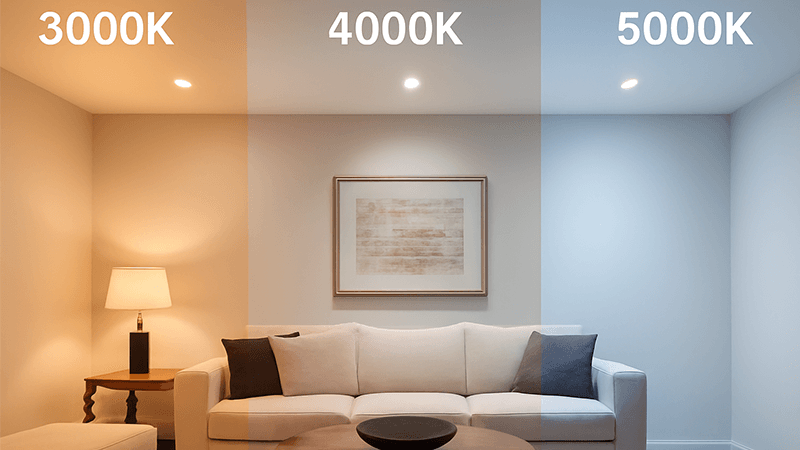
As a manufacturer, I’ve seen firsthand how color temperature, measured in Kelvin (K), completely changes a space. It’s not just about light; it’s about mood and function. Think of it like this: lower Kelvin numbers mean warmer, more yellow light, like a sunset. Higher Kelvin numbers mean cooler, bluer light, like midday sun.
I once worked with a hotel developer who wanted to use a single color temperature throughout their property to simplify purchasing. They were considering 4000K for everything. I advised against it. While 4000K is great for lobbies and conference rooms, it can feel too clinical and sterile in a guest room where people want to relax. We ended up with a dual strategy. We used 3000K for the guest rooms to create a cozy, residential feel. We used 4000K for the hallways, gym, and meeting areas to keep them bright and alert. The project was a huge success, and the feedback on the lighting was fantastic. This experience taught me the importance of matching the light to the life lived in the space.
General Recommendations by Space
| Room Type |
Recommended CCT Range |
Why it Works |
| Bedrooms, Living Rooms |
2700K – 3000K |
Promotes relaxation and comfort. This warm light is easy on the eyes and creates a cozy, intimate setting. |
| Kitchens, Bathrooms |
3000K – 4000K |
Provides clean, bright light for tasks like cooking and grooming, ensuring good visibility without being too harsh. |
| Home Offices, Studies |
4000K – 5000K |
A neutral to cool white light helps maintain focus, reduce eye strain, and improve productivity during the day. |
| Garages, Workshops |
5000K – 6500K |
Mimics daylight, providing maximum brightness and clarity for detailed work and ensuring safety. |
Choosing the right CCT is a balance. It’s about how you want people to feel and what they need to do in that environment.
What is the color temperature of downlights?
Are downlights different from other lights? It seems like they have their own rules for color temperature. You need to understand their specific range and popular options.
Downlights are available in a full spectrum of color temperatures, usually from a very warm 2700K to a cool 6500K. The most common and popular options that manufacturers produce are 3000K (Warm White), 4000K (Neutral White), and 5700K (Cool White).
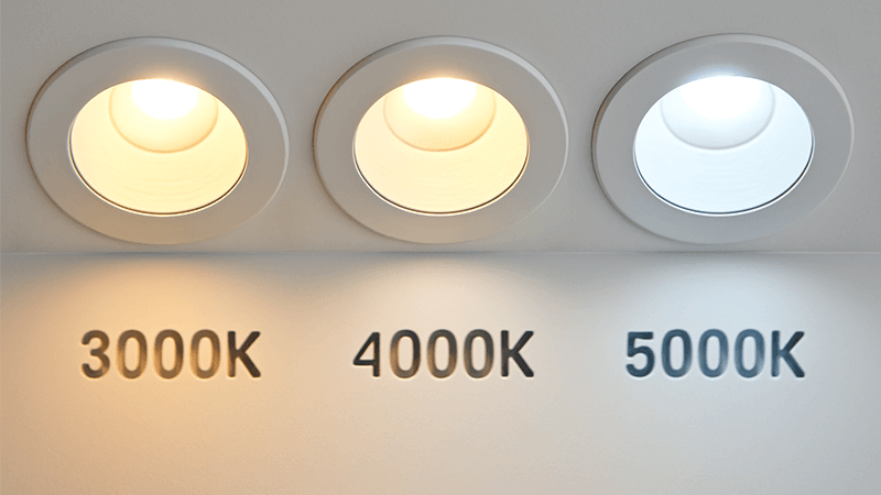
In my factory, we produce downlights across this entire range, but 90% of our orders are for 3000K and 4000K. This isn’t a coincidence. These two options cover most commercial and residential needs. However, the technology has evolved, giving buyers like Shaz more flexibility than ever before.
Fixed vs. Selectable CCT
There are two main types of downlights you can source:
-
Fixed CCT Downlights: These lights have a single, unchangeable color temperature. A 3000K downlight will always be 3000K. This is the traditional, cost-effective option. For a large project where the lighting design is already decided, fixed CCT is perfect. You know what you need, so you order it. It simplifies the product and often lowers the cost.
-
CCT Selectable Downlights: These are a game-changer. I remember when we first started developing these. They have a small switch on the driver or the back of the fixture. This switch allows the installer to choose between several color temperatures, usually 3000K, 4000K, and 5000K, all in one unit.
For distributors and contractors, CCT selectable downlights are incredibly valuable. Instead of stocking three different products, you only need to stock one. This reduces inventory costs and complexity. If a client changes their mind on-site about the mood of a room, you can simply flick a switch instead of reordering and reinstalling the lights. I’ve had many purchasing managers tell me this feature saved them time and money, and it’s why they’ve become so popular. It offers insurance against design changes and streamlines the supply chain.
Is 4500K or 5700K color temperature better?
Stuck between a neutral and a cool white? Making the wrong call can make a space feel like a clinic or a warehouse. You need to know which is better.
Neither is inherently "better"; they serve different purposes. 4500K is a pure, neutral white that is excellent for task lighting. 5700K is a cool, bluish-white that mimics daylight, ideal for high-detail work or creating an energetic, outdoor feel.
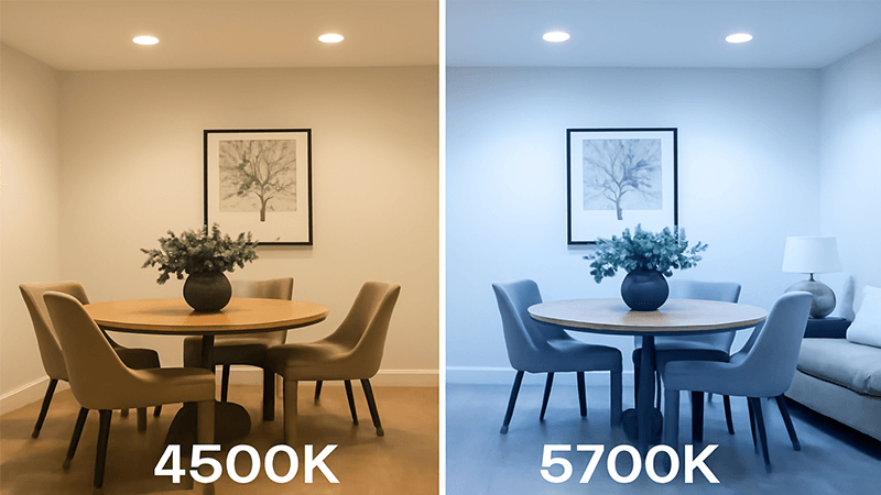
When I’m talking with clients, I often call this the "Focus vs. Energy" choice. The decision depends entirely on the intended application and the psychological effect you want to achieve. Let’s break down where each one shines.
The Case for 4500K: The Neutral Taskmaster
I think of 4500K as the ultimate neutral. It has almost no yellow or blue tint. This purity makes colors appear true and accurate, which is why it’s a favorite in certain commercial settings.
- Best Uses for 4500K:
- Retail Stores: Especially for clothing or furniture, 4500K displays products in a clean, natural light without color distortion.
- Offices and Classrooms: It’s bright and helps with focus but is less harsh and stimulating than higher Kelvin temperatures, making it comfortable for all-day use.
- Modern Kitchens: For a clean, contemporary look where you need accurate light for food prep, 4500K is a great choice. It feels professional and efficient.
The Case for 5700K: The Daylight Energizer
5700K is intense. It’s designed to replicate bright daylight. This high-energy light can boost alertness and productivity, but it can also feel stark and industrial if used in the wrong place.
- Best Uses for 5700K:
- Warehouses and Factories: In my own production facilities, we use lighting around this temperature. It maximizes visibility for detail-oriented tasks and safety.
- Hospitals and Labs: Medical environments require bright, clear light for examinations and procedures. 5700K provides the necessary clarity.
- Garages and Workshops: For mechanics or hobbyists who need to see fine details and true colors, 5700K is invaluable.
A client of mine, a contractor for a chain of art galleries, was debating this exact issue. We tested both 4500K and 5700K track lights on the same piece of art. The 4500K light rendered the colors accurately and felt clean. The 5700K light, while brighter, introduced a slight blue tint that altered the feel of the painting. They chose 4500K for all their galleries. For your projects, Shaz, consider the tasks being performed. If it’s general work, 4500K is a safe bet. If it’s high-detail or industrial, 5700K is the way to go.
Is 4000K too bright for a living room?
Worried 4000K will make a living room feel cold and uninviting? This is a common concern when trying to balance modern style with comfort. You want a clear answer.
Yes, for most people, 4000K is too bright and clinical for a living room. This space is for relaxation, and 4000K light can feel more like an office or retail store, hindering a cozy and comfortable atmosphere. A warmer 3000K is almost always a better choice.
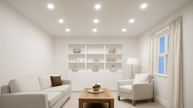
The living room is the heart of the home. It’s where families gather, relax, and unwind after a long day. The lighting should support that feeling. The science of circadian rhythm tells us that cool, blue-toned light (like 4000K) signals to our brain that it’s daytime and we should be alert. Warm, yellow-toned light (like 3000K) signals that it’s evening and time to wind down. Using 4000K in a living room works against the very purpose of the space.
I had a personal experience with this. When we were renovating our home, my wife and I were debating lighting. As an engineer, I was drawn to the clean, crisp look of 4000K. I installed 4000K downlights in our living room. For the first few days, it felt bright and modern. But in the evenings, it never felt right. The room felt sterile. We didn’t feel like sinking into the couch to watch a movie. It felt like we were waiting for a meeting to start. After a week, we switched them out for 3000K downlights. The difference was immediate. The room felt warm, welcoming, and instantly more comfortable. It became a home again.
When Might 4000K Work in a Living Space?
There are exceptions, but they require careful planning.
- Layered Lighting: If the 4000K downlights are just one layer of light, it can work. For example, you might use 4000K for general ambient light but then add table lamps and floor lamps with very warm 2700K bulbs. This allows you to have bright, clean light when you need it (like for cleaning or a party) but switch to a cozier feel for daily relaxation.
- Dimmers are Essential: If you insist on 4000K, a dimmer is non-negotiable. Being able to reduce the intensity can soften the clinical feel and make the space more usable in the evening.
However, my honest advice to partners and clients is always to keep it simple and effective. For living rooms and bedrooms, choose 3000K. It delivers the right mood every time, creating a space that feels like a sanctuary, not a workspace.
Conclusion
Choose 3000K for a safe, warm feel, or use it in living areas. Pair it with 4000K in kitchens and studies for the perfect, modern lighting plan.