Choosing the right downlight feels complex. Pick the wrong one, and the colors in your space look lifeless. I will help you understand CRI to make the best choice.
The Color Rendering Index (CRI) rating of an LED downlight measures how accurately it shows colors compared to natural sunlight. Most downlights range from CRI 80 to CRI 95+. A higher number means colors will look more true and vibrant under the light.
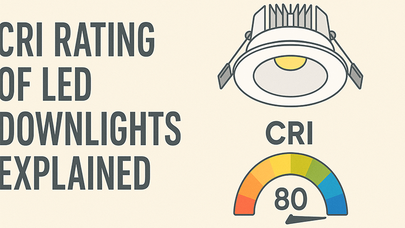
This CRI number seems simple enough. A higher number is better, right? But my years in the lighting industry have taught me there’s much more to the story than just one number. The real secret to great lighting goes beyond the spec sheet. Let’s dig deeper to see what these ratings really mean for your projects and how you can avoid common pitfalls.
What is CRI in LED lights?
You see "CRI" on every spec sheet, but what does it really mean for your project? This uncertainty can lead to poor lighting choices. Let’s break it down simply.
CRI, or Color Rendering Index, is a scale from 0 to 100. It measures a light source’s ability to reveal the true colors of objects. A perfect 100, like sunlight, shows colors perfectly. Lower CRI values make colors appear washed out or unnatural.
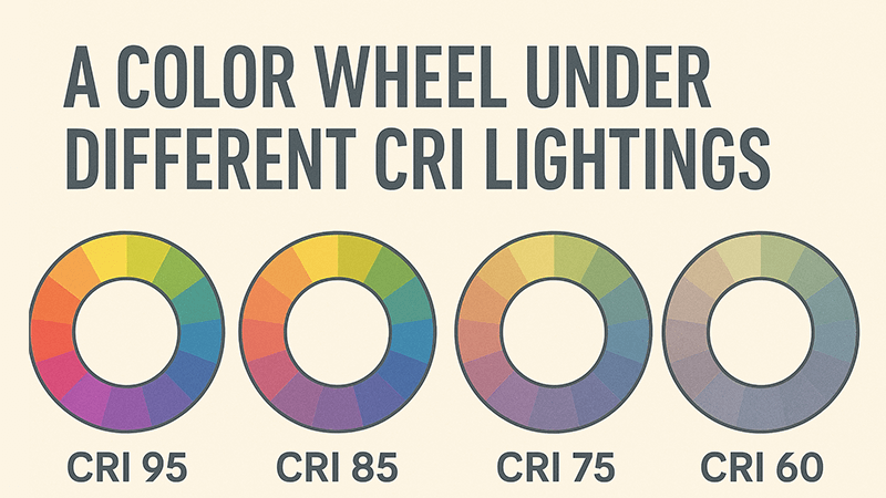
The CRI value tells us how a light source performs compared to a reference source, which is usually natural daylight. The test measures how well the light renders a set of 15 specific pastel colors called Test Color Samples (TCS). The general CRI number you see on a box, like "CRI 80" or "CRI 90," is actually just an average of the first eight samples (R1-R8). This is a crucial point because it doesn’t give you the full picture. The test doesn’t even heavily weigh strong, saturated colors like deep red (R9), which is vital for making skin tones, wood, and food look rich and natural. A light can have a good general CRI score but perform poorly on specific, important colors.
Why The CRI Number Can Be Deceptive
Over my career, I’ve seen countless examples of why relying only on the general CRI value is a mistake. The real world has millions of colors, not just the 15 used in the test. Two downlights with the exact same CRI 90 rating can make a room feel completely different. I once tested two such lights for a client’s project. One made the red accents in the decor pop beautifully but left the blue artwork looking dull and muted. The other light did the complete opposite. Both were technically "CRI 90," but their performance was worlds apart because their light spectrums were different.
| Feature |
Downlight A (CRI 90) |
Downlight B (CRI 90) |
| Red (R9) Score |
High (e.g., 85) |
Low (e.g., 40) |
| Blue Rendering |
Poor |
Good |
| Overall CRI |
90 |
90 |
| Visual Effect |
Makes reds and skin tones look great |
Makes blues and cool tones look great |
This is why just looking at the CRI number isn’t enough. You have to understand that it’s an average. For a purchasing manager like Shaz, it’s vital to ask suppliers for more detailed photometric reports, including individual R-values like R9, if color accuracy is critical for a project.
What is a good CRI for LED lights?
You need to select lights for a project, but you don’t know which CRI is "good enough." Choosing a CRI that’s too low can ruin the look and feel of a space. Here is a quick guide.
A "good" CRI depends on the application. For general residential and office use, CRI 80+ is acceptable. For spaces where color accuracy is important, like retail stores, art galleries, or high-end homes, you should aim for CRI 90+ to ensure colors look their best.
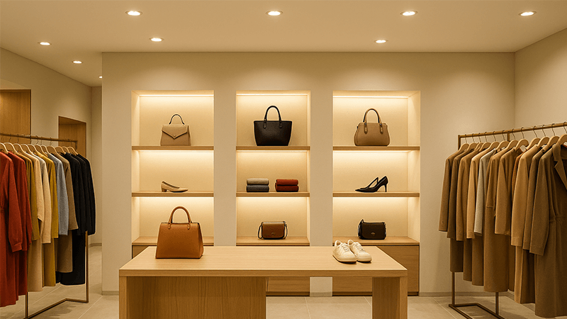
Choosing the right CRI is about balancing cost, energy efficiency, and visual quality for a specific environment. A higher CRI often means a slightly higher cost and a small drop in energy efficiency (lumens per watt), so it doesn’t make sense to over-specify for every single application. You wouldn’t put a CRI 95+ museum-grade light in a warehouse storage aisle. The key is to match the CRI rating to the tasks and expectations for the space. For a purchasing manager, creating standards for different project types is an efficient way to manage sourcing and guarantee quality where it matters most.
Matching CRI to Your Space
Let’s break down where different CRI levels are most appropriate. This is the framework I use when advising my partners, and it helps ensure they get the right performance without overpaying. For example, in a commercial office, clear and comfortable light is important for productivity, so CRI 80 is a solid baseline. But in the executive boardroom, where you want to impress clients and make presentations look sharp, stepping up to CRI 90 makes a noticeable difference. It’s about being strategic.
| CRI Rating |
Quality |
Common Applications |
| 70-79 |
Poor/Basic |
Outdoor security lighting, parking garages, warehouses, areas where color identification is not important. |
| 80-89 |
Good |
The standard for most homes, offices, schools, and general commercial spaces. A good balance of quality and cost. |
| 90-94 |
Excellent |
High-end residential projects, retail stores, restaurants, hospitals, and anywhere color appearance is a key feature. |
| 95+ |
Professional |
Art galleries, museums, print shops, photography studios, and medical examination rooms where perfect color accuracy is critical. |
Understanding this table helps you specify with confidence. When you’re sourcing for a large mixed-use project, you can use this guide to save costs in back-of-house areas while investing in high-quality lighting in customer-facing spaces. This approach shows your clients that you are not just a purchaser, but a knowledgeable partner.
Is CRI lighting 80 or 90 better?
You’re stuck between two options: a standard CRI 80 downlight and a more expensive CRI 90 version. The price difference makes you hesitate, and you wonder if the upgrade is worth it.
CRI 90 lighting is better than CRI 80 because it renders colors more accurately, making spaces feel more vibrant and natural. While CRI 80 is acceptable for basic tasks, CRI 90 provides a visibly superior quality of light, especially for skin tones, food, and textiles.
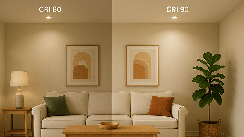
The jump from CRI 80 to CRI 90 is one of the most noticeable improvements you can make in lighting quality. While a CRI 80 light is functional, it can leave colors looking slightly flat or "off." A CRI 90 light brings them to life. I remember walking a client through a newly renovated hotel lobby. We used CRI 80 lights in the service corridors and CRI 90 lights in the main reception area. The client was stunned by the difference. Under the CRI 90 lights, the rich wooden reception desk, the plush red sofas, and even the skin tones of the staff looked healthier and more inviting. It’s not just about seeing colors; it’s about feeling the quality of the space.
The Real-World Impact: Beyond the Numbers
The choice between CRI 80 and CRI 90 is a practical business decision. You have to weigh the visual benefit against the budget. For many of my partners, like Shaz who handles large projects, the slightly higher initial cost of CRI 90 products is a smart investment, not an expense. A better-lit retail environment can lead to increased sales. A more pleasant restaurant atmosphere can lead to happier customers who stay longer. A more welcoming hotel lobby creates a stronger first impression.
Let’s look at the specific advantages of CRI 90:
| Feature |
CRI 80 |
CRI 90+ |
Impact on a Project |
| Red Rendering (R9) |
Often low or even negative. |
Typically high (50+). |
Makes wood grains, red fabrics, and skin tones look rich and full. Essential for hospitality and residential. |
| Color Saturation |
Colors can appear dull. |
Colors appear vibrant and true. |
Products on a retail shelf look more appealing. Food in a restaurant looks fresher. |
| Visual Comfort |
Functional, but can feel artificial. |
More natural, closer to daylight. |
Creates a more comfortable and high-end feel, reducing eye strain and improving mood. |
The decision comes down to the goal of the space. If the goal is simply to illuminate, CRI 80 is fine. If the goal is to create an experience, to showcase products, or to enhance well-being, then CRI 90 is the clear winner and provides a strong return on investment.
What is the CRI rating of downlights?
You’re sourcing downlights and see a huge range of CRI ratings, from 70 to 97. This variation makes it hard to know what the industry standard is or what you should expect.
The CRI rating of most commercially available LED downlights today is between 80 and 95. A CRI of 80 (CRI80) is the common standard for general-purpose applications, while CRI90 and higher are considered high-quality for projects where color accuracy is important.
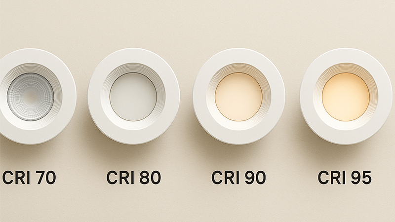
The market has shifted significantly over the last decade. A few years ago, CRI 70 was common, but now, thanks to advances in LED technology, CRI 80 is the established baseline for almost any reputable manufacturer. At my company, iPHD, we don’t even produce downlights below CRI 80 because the quality is simply not good enough for modern standards. Anything below 80 is typically reserved for very low-cost, industrial, or outdoor applications where color doesn’t matter. The real discussion for professionals today is about the benefits of specifying CRI 90+ and looking beyond the CRI number itself to the entire light spectrum.
The Move Towards Full-Spectrum Lighting
Here’s the inside perspective I share with my partners: even a high CRI number can be misleading if the light spectrum is incomplete. A light’s spectrum is the mix of different colors of light it produces. CRI only checks a few points on that spectrum. This is why I’ve seen a CRI 95 downlight that felt harsh and unnatural—it had "spikes" in its spectrum to hit the test colors but was missing light in other areas. This missing part of the spectrum can affect more than just colors; it can impact human mood and even our natural sleep-wake cycles (circadian rhythm). A light that is deficient in the 460nm blue wavelength, for example, might be less effective at promoting alertness during the day, even with a high CRI.
This realization led us at iPHD to develop our "full-spectrum" series of downlights. These lights might have a rating of "only" CRI 85 on paper, but they are engineered to produce a smooth, continuous spectrum of light, much like natural sunlight.
Full-Spectrum Light vs. High-CRI Light
- High-CRI Light: Aims to get a high score by hitting the 15 test colors well. Can have a "spiky" and incomplete spectrum.
- Full-Spectrum Light: Aims to replicate the full, continuous spectrum of natural daylight. Provides excellent color rendering across all colors, not just the test samples.
In practice, a space lit with our CRI 85 full-spectrum downlights often feels more natural, comfortable, and visually pleasing than one lit with a standard CRI 95 light. This is the future of lighting quality—moving beyond a simple number to consider the complete health and visual impact of the light.
Conclusion
Understanding CRI helps you choose lights that make colors look true. Remember, a higher number is often better, but the full light spectrum tells the complete story of quality and comfort.